You are using an out of date browser. It may not display this or other websites correctly.
You should upgrade or use an alternative browser.
You should upgrade or use an alternative browser.
Deadpool! (finished)
- Thread starter K1LLKANO
- Start date
Flying Jinko
New member
Re: Deadpool! (finsihed)
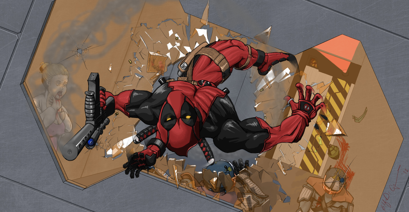
Really awesome pic, but I'm afraid I can't understand it fully. Is the extra hand behind him something Im missing out on?
Really awesome pic, but I'm afraid I can't understand it fully. Is the extra hand behind him something Im missing out on?
TheLevelBest
New member
Re: Deadpool! (finsihed)
Same here. Just a little bit confused...
Really awesome pic, but I'm afraid I can't understand it fully. Is the extra hand behind him something Im missing out on?
Same here. Just a little bit confused...
K1LLKANO
New member
Re: Deadpool! (finsihed)
Sorry for the confusion there. It's the bad guy's hand. He is reaching over and grasping the wall to pull himself as far away from that grenade as possible (fruitless of course, but he's reacting emotionally in this stressful situation") )
)
If you look back at this thread, it's easier to see. I added in a lot more glass to fix the emptiness and it masks what is going on. Looks like I should have moved the hand down a couple layers during the touch-up as it stands out unnaturally now =/
Really awesome pic, but I'm afraid I can't understand it fully. Is the extra hand behind him something Im missing out on?
Same here. Just a little bit confused...
Sorry for the confusion there. It's the bad guy's hand. He is reaching over and grasping the wall to pull himself as far away from that grenade as possible (fruitless of course, but he's reacting emotionally in this stressful situation
)If you look back at this thread, it's easier to see. I added in a lot more glass to fix the emptiness and it masks what is going on. Looks like I should have moved the hand down a couple layers during the touch-up as it stands out unnaturally now =/
InterestingMK
Member
Re: Deadpool! (finsihed)
Looks pretty cool. Who's the guy on the right?
Looks pretty cool. Who's the guy on the right?
GBK
New member
Ok, so here it is finally.
Marvel heroes rock DC heroes any day :aetsch:
Excellent work. I know many of your works trough dA, this one is definitive one of your best ones i belive
K1LLKANO
New member
Looks pretty cool. Who's the guy on the right?
Random_BadGuy_12
I think the extra hand they were talkin about is his foot. (Cause I thought the same thing.) Looks great though KK you artistic s.o.b! lol Why'd he have to shoot granny though? Makes Deadpool look like he likes to munch on butts.
Haha, thanks
The chick is actually pretty young, it's just the surprise and pain in her face that make her look older. I was trying to portray him escaping from some lab where maybe they were experimenting on him. Or maybe it's just a animal testing facility and DP isn't down with that shit 
AMES32
God of War Fanboy
Ok, so here it is finally.
Marvel heroes rock DC heroes any day :aetsch:
how do you color like that? I think it could bring my art up to a new level.
K1LLKANO
New member
how do you color like that? I think it could bring my art up to a new level.
Which aspect of the coloring are you talking about? It's all relatively easy to learn and I could whip up a tut for ya if I know what it is you're looking for.
InterestingMK
Member
Why does Deadpool have three arms?
Flying Jinko
New member
Why does Deadpool have three arms?
It's actually deadpool's foot. If you zoom in you can see that the 'hand' portion belonging to the guy lying below deadpool, meets his foot tip making it look like a hand.
InterestingMK
Member
It's actually deadpool's foot. If you zoom in you can see that the 'hand' portion belonging to the guy lying below deadpool, meets his foot tip making it look like a hand.
Oh, ok. I thought the black stuff on his foot was fingers.
K1LLKANO
New member
AMES32 said:the shading I've never been able to figure out how to do it right.
Going to update this post with a tut for shading, hopefully to help more than just AMES, but even if it only helps him I'll be happy. I'll keep editing this post to keep it in one place, with the current piece I'm working on, so you're going to get a WIP as well
Part one, highlights.

Ok, I personally don't usually do this, but it helps as a visual to decide and place where your light sources are coming from. This will help you place your shadows (parts of something not in the light. these should get darker the further away from the light source and follow the contour of the whatever shape you're shading), cast shadows (shadows created by something blocking the light source which can cross into areas that would be lighted if the item wasn't there. these are usually hard lined and consistent in darkness) and highlights (areas closest to the light source(s). these should give your image that pop, shadows will add the illusion of 3d, highlights will make the image jump out).
This image has 10 light sources, so it might be a bit confusing as to what would and what would not be in shadow, but they vary in direction and height (lower light source from the front, higher in the back).
Shadows - This is where I usually start when doing a picture, as they give the depth.
Highlights - These are where the light bounces off of whatever you're coloring; the closer they are to the light source, the stronger the effect. Since this was done in a comic book style, I'm going to cover that here (if you wanted to do it in a non-comic book style, just remove the inks). In this style you really only have to do highlights for things that are black. When you color your image, you will add the rest of the highlights in there, but you can't get any brighter than white in a B&W image


I've left this undone on purpose so you can see the process. I've taken the areas that are highlighted and removed the black from them. If it was a smooth item, you would be done there, but since this is more textured, I've added that in. I did it by drawing shadows that extend into the highlighted area to convey wrinkles in the leather. Then you have to highlight the part of the wrinkle that goes into the non-highlighted area to finish off the effect. When finished, you should have something that appears black but still establishes detail in your image instead of just obscuring it.
Coloring...
Reflective Light...
Last edited: