You are using an out of date browser. It may not display this or other websites correctly.
You should upgrade or use an alternative browser.
You should upgrade or use an alternative browser.
Whats this? Whats this?! ~ TRMK Drawings thread
- Thread starter BBBLP
- Start date
FlawlessVictor
New member
Hey Flawless, what do you think of the forehead?
Is it too large? I'm trying to make it look like his head is slightly tilted downward.
Hmmm....I thought the head was in neutral position, turned slightly to the side. The forehead would be okay in that instance.
If the head is tilted, you need to change the position of the entire head. That also means you need to realign all of the features.

Notice when the head is titled the downward, the lines for the eyes, nose, etc. start to shift downward as well. The top of the head becomes more prominent while the chin starts to "vanish".
Last edited:
")


Shirayuki Mizore
New member
Congrats BBBLP! It looks good!
The only thing I could say is to put a little more detail into the jacket. Like, the collar looks great! But everything else looks a little plain. So I'd say add a little more wrinkles in there and you're good to go so it looks the jacket is falling on him more naturally.
The only thing I could say is to put a little more detail into the jacket. Like, the collar looks great! But everything else looks a little plain. So I'd say add a little more wrinkles in there and you're good to go so it looks the jacket is falling on him more naturally.
Shirayuki Mizore
New member
I noticed that right after I potsed it.
One more update
Good job man!
Can't wait to see the new update!

Shirayuki Mizore
New member
I say remove the wrinkle in his left shoulder (our right) and you're all good brother.
FlawlessVictor
New member
Wrinkles occur very often near the joints. The wrinkles that are on the upper part of the sleeve don't make sense to me though. Don't add wrinkles for the sake of "more detail". There has to be a reason why the cloth is being compressed.
Last edited:
FlawlessVictor
New member
Something is amiss with the pointer finger. It seems to be too pointy. Granted, he is wearing gloves, so it may not actually perfectly mold with actually the shape of actual fingers.
Creases around the mouth should start near the nares, like this:

I think they should be further apart, considering the bridge of the clown's nose is pretty broad.
I would say it's a big improvement. You are getting a hang of proportions and placement of facial features.
Creases around the mouth should start near the nares, like this:
I think they should be further apart, considering the bridge of the clown's nose is pretty broad.
I would say it's a big improvement. You are getting a hang of proportions and placement of facial features.
FlawlessVictor
New member
Is that you?
No, it's just something I pulled from a website that hosts public domain images.
I see what you mean. Looking at that picture, I should have made the mouth creases a bit higher. Made the nostrils too high it seems. All in all it seems as if I made the face a bit too long.
Some people do have long faces, so I don't know if that's a big issue. I'd say move the nostrils down, halfway between the eyes and the mouth.
FlawlessVictor
New member
I normally avoid double posting, but the time gap is quite long....
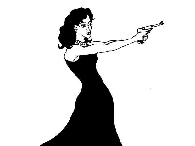
Drawing itself is months old, but I recently filled it in and went over the lines in markers. Also, I failed at drawing a Luger.
Drawing itself is months old, but I recently filled it in and went over the lines in markers. Also, I failed at drawing a Luger.
Shirayuki Mizore
New member
I like it! It reminds me of like a 007 movie.
FlawlessVictor
New member
I like it! It reminds me of like a 007 movie.
Actually I had pulp fiction illustrations and gangster films in mind when I drew this, although 007 seems fitting as well.
pimppaperclip
New member
Recently did this Noob Saibot, nothing too big and cool, just simple 