tremor_209
New member
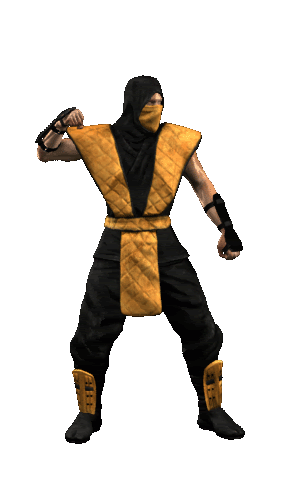
k, time for critique
I may have to do some post work in Photoshop to try and blend the animations. If not, there will be a snap when he plays the stance animation, because the normal map and model is mirrored.
I really like the background, the melody threw me off but after a while I got used to it.
I don't think there's much to do with music though, sounds like most of it has already been taken care of.
woah! He's doing the Hokey Pokey ! ! Amazing for me ! !
Ok, fixed alot of things,
-added texture to foreground stone elements
-darkened background floor coloring to brownish color
-added pink highlight to door frame
-softened and lightened shadows
and a few other things I can't remember right now. I've got to get some sleep.

good! But I want to add some crits . . Uhm. . The sky is so normal, I suggest to try adding a gradient of it to make it more cooler . . And I'm also curious about the height of the Masked guards . . And last I prefer the old stone texture . .

")


 good work