Badmouse has the props you need mostly.
Hi, i remaking the warrior shrine, i dont't like the actual quality. I want to give it more details.
Sub-Zera, the buddha looks amazing! great work.
calactyte, The final stage looks great.
")
Badmouse has the props you need mostly.
Well, yeah.....I know thats the MK II Raiden. Hes just a place holder for this but Im glad to hear he isnt the final version.
Yeah, that would be Sal Davita playing Raiden instead of Carlos Pesina for some odd reason in Trilogy versus screen. Either way though *wipe's forhead*
It's not even a place-holder I'm not really on the team (except for perhaps putting together a package for Mac users to play this game). I'm not doing any of the graphics or core gameplay. It was just something I whipped together quickly for illustrative purposes to show how an HD sprite could be scaled to be the proper height compared to the rest of the scene vs the original game and to show how the same sprite can look more or less the right size depending on how big it is in relation to the rest of the scene.


") :
: The only thing KI can possibly have over this is the FMV backgrounds it had giving making every single item in it full parallax. They literally rendered out the BG into separate FMV frames which then display the proper one depending on which part of the stage you are at. I don't know if MUGEN is capable of something similar though.


I think it looks a lot better now.
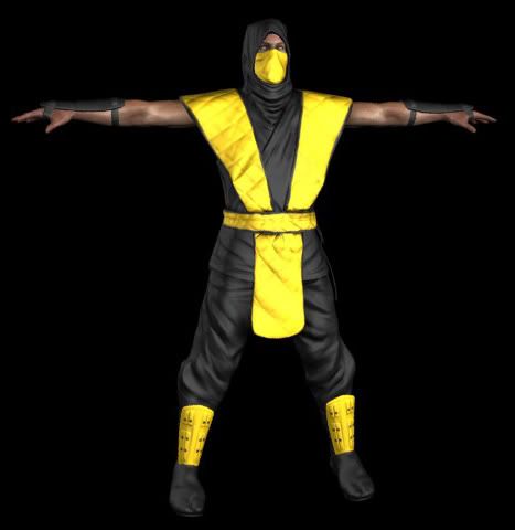
Progress on scorpion has been kind of slow, I'm trying to do some work on it every night. I got the base colors in and I've been working on the skin shader. I'm not really happy with how it looks yet, he doesn't look real enough. Everything but the skin still has a standard plastic shader.
Only one thing i want to ask for is that dragon yellow-red shits, i love them so much, and they are the same in our stages Please, send me on subzera@mail.ruok title screen, redrawn and hdified.
Enjoy it guys.

OK Only one thing i want to ask for is that dragon yellow-red shits, i love them so much, and they are the same in our stages Please, send me on subzera@mail.ru
I would agree that the main title screen looks great although in a way I kind of think it actually looks a little too clean. Kind of like just a simple gradient was used for the background. It lacks texture and character in my opinion but that may be due to the dithering they originally used.. but it kind of also looks more than that to me like there is some kind of actual texture to it:
Perhaps in HD metal flake type deal could be used...
Here's an example I whipped up:
I used this texture I edited up and set the layer to overlay with 75% opacity. I actually surprised myself on how well a metal flake type texture works with it to make it look more like the original.
Also the scorpion model does have some good progress although as Bleed noted it's still very incomplete without the specific shaders it needs like for the cloth and such... and yeah he doesn't look real enough yet.

