Mortal Kombat HD Remix with MUGEN

Finally for pc, I will get it as soon as possible :P

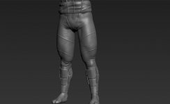
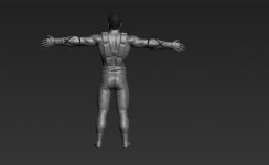
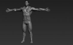
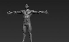
here's what I got, fixed the hair, and legs


and please don't tell me about the pants animation, it looks like that cause the pants are low poly, to make the animation look more realistic I have to apply turbosmooth and my viewport is already too slow to apply the turbosmooth modifier to the pants, and also the pants, will be black, not green so it will be harder to notice in gameplay, and I will calculate the pants animation again later, maybe that funny animation disappears
 
here's what I got, fixed the hair, and legs
Well, that is some improvement there. :)
The left arm looks good, the pants and hair look better.
The feet animation is much better too. The right foot looks great.

Now I only think he is raising his left foot and knee too much as it goes forward, as if he was walking over a small object.
I'd also make the head a tad bigger yet.
His right shoulder should be even smaller.
His right hand should be a bit higher and the thumb should be hidden behind the hand.
His right forearm looks collapsed near the elbow joint.
His left shoulder should be higher. Notice how angular it is in the original and how round it is in yours. Raising the shoulders will also get rid of the negative space under his chin.
The front of his face should be vertical (it's leaned forward in yours).
The pants' top should be moved higher, and the lower part should go lower to cover the start of the shoes (and that visible skin).
Also, the knees are too high, like the thighs are too short and the lower leg is too long.

Here's a new "comparative suggestion":

LKcomp_zps03932213.gif


EDIT: Just for the sake of it, rejoice in seeing how far you've come from this. Keep up the good work.
 
Last edited:
arq_hawkin, great work on walking animation! But... Is it just me or Liu Kang's hair get brighter during some moments of animation?
 
That's just great, hawkin. :)
The right elbow joint is still a little too flat, but it's not a big deal.
Also, I'd make the skin tone lighter, shinier (especially on the chest) and more yellowish, but you just got there.
Anything that improves from now on is a plus.
Congratulations!

EDIT: Couldn't you get around making the left foot step heel-first instead of tip first?
 
Arq youre the man!, liu kang looks fantastic... also uker yo got an eagle eye for the details... this is really a great co-work.

I love to see how you guys improve on every showed result.
 
Much appreciated.
I also want to commend on hawkin's persistence in his attempts to cope with my constant nitpicking and improve the model and animations.
I know it's not an easy thing to do.
 
Thanks guys, also thanks a lot uker, without him I couldn't get this far since he is always pushing me to get things right :p, uker you definitively have to get into this 3dworld
 
Hawkin, thanks for your comments.
It's a pleasure to collaborate with you.
And yes, given the time, I'd really like to get myself into 3D modelling.

Now, just for the hell of it:

walking_zps95e463cb.gif
walk_zps46e9624e.gif
MK1_Liu_Kang_Walk_Forward.gif


Nice progression.

Something I'm noticing is that in the original the camera seems to be at mid-thigh height, while in yours seems a little above the waist.
This causes more of the right foot visible and some height disparity between the two feet, while in the original they appear to step on the same line.
This however is not important, since I guess it will be Bleed doing the final renders in his light rig once you have created all the animations.
 
Last edited:
I like this Liu model too.
It is very interesting, why are those ninja models are looking so photo realistic, when the models with opened face and naked torso are looking just like 3d models?
 
Mainly two reasons:
- The more human features you show, the more "fakeness" becomes evident.
- Bleed's modelling experience/talent. Nuff said.
 
@arq_hawkin I feel guilty for saying it looks ready and then dropping off this, but hey, I can't help it. :P

I'm leaving you some stuff I keep noticing, that perhaps you can keep in mind should you get in the mood to do some more touchup to it:

- Right forearm still looks flat near the elbow. Look how the arm has pretty much the same girth there as in the wrist and it's about twice as big in the original. Probably some problem with the fold in the joint. Maybe Bleed can help with that.
- Although the pants are miles better than they were, they still look stiff and inflated, kinda like this. They should look like the fabric falls freely. Look at the way the pants wrinkle on the lit side of the right leg in the original. Also look how the top of the left leg is straight in the original and inflated in your version. Also, the top should probably have a 2-inch elastic strip that fits tightly around the waist so that it doesn't look inflated there either. That could make the pants go a little higher, and it's OK. It's still a bit higher in the original anyway. Again, I think this is what you should aim for.
- His body gets wider at the pants' waist like his pelvis is too wide. The waist goes down pretty straight into the legs in the original, and that, together with the puffy pants, makes him look curvy in a way that it shouldn't.
- The head should be flatter on the top (it was flatter before), and maybe a bit flatter on the back too. There should be less hair visible behind the ear at the back of the head.
- The left foot is still stepping tip first, when the original animation steps heel first.
- Skin should be lighter, more yellowish. Also it should be shinier in the chest.

 
Last edited:
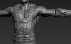
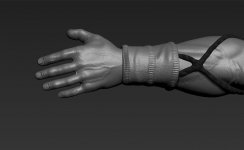
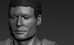
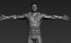
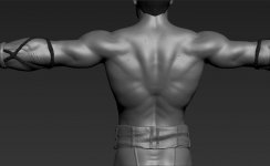
hello guys, I know maybe I'm out of subject but I wanted to show you what I've been working on for the last week, just to put together all I've learned here.....

v1.jpgv2.jpgv3.jpgv4.jpgv5.jpgv6.jpgv7.jpgv8.jpgv9.jpgv10.jpg


Uker!!! ATTACK :bird:
 
Nice work on the face.
Now here's this:

SZ_zps914048fb.gif


Made thighs larger.
Made lower legs MUCH larger.
Made forearms smaller and arms shorter.
Reduced the gap in the crotch.
 
Top