Mortal Kombat HD Remix with MUGEN

Well, if you actually have a version that has that melody I'm not gonna argue.

My suggestion is still, give that instrument more presence and a meaner, less bright tone.
Lower an octave and raise volume maybe?
Try a slapped bass maybe? Something that while still defined, sound more like actual bass.
I think I pay more attention to it than the actual main tune and I'm not feeling it has the same presence as in the original.

Other than that, yeah, I think the song is great.
That empty feeling from the last version is sure gone.

EDIT: I also miss that electric stringy thing that sounds every 8 beats and then goes on to echo on every beat. See 0:14 and 0:18 here.
Maybe throw in some of those elec guitars that you've been adding to your songs?
 
Last edited:
As far as the mid melody's instrument is concerned, I just don't think and never have thought that it is meant to be a bass. Especially considering there is already an actual bass in the track. I always heard it as either another plucked instrument such as a bass koto or even a mallet instrument. Never a bass guitar though.
 
Well, maybe not a bass guitar then.
I know it's a stupid way to explain it, but I think of that sound as more "dum-dum-dum" than "clang-clang-clang". XD
Like the attack is too bright.
The bass koto could be an interesting option if played low enough.
In any case, a bit more volume I think would help.

Sent from my Nexus 4 using Tapatalk 4
 
Last edited:
I just read your edited comment.
I too have been listening to several versions.
Namely, from MAME, from the CDA track of the SegaCD version of the game, from MKAC and several from YouTube.
I may have had some mixups along the way.
When I get the time I'll dump the audio from MAME myself to be sure and look into that one, which I understand is the one you'll be going by.

Sent from my Nexus 4 using Tapatalk 4
 
Last edited:
I listened to the song a couple of times and I think I can live with that instrument after all.
I think I can even live with the sequence not being exactly the same if we don't get one that seems to fit.

What is bugging me a bit though is that I never hear it doing that F F D# D# F F sequence in your version.
I only hear it alternating between F F D# D# F D# and ocassionally F F D# D# F, and it's one of those things where you're mentally following the song and when it hits it throws you off.

If you change that and add the echoed elec guitar string I mentioned before, I think I'm sold. :)
 
Last edited:
Hello all. I just wanted to say everything is looking really great so far guys. I am so happy to see the level of detail and attention you have been giving Raiden and Liu Kang most recently and that I have no doubt they will be right on par with the ninjas model. I am a true fan of the Mortal Kombat universe and this is something I am anxiously looking forward to playing. Keep up the awesome work. Thank you!!
 
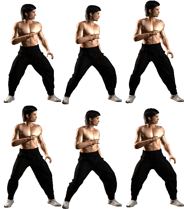
Can't really tell much for now but I can quote my earlier post with original stance in it for comparison:

2s3.gif

Looking at it on my crappy phone, I think hair is just a bit too bouncy maybe reduce it just a little bit, pants don't seem to loop smoothly (there's a twitch on the pants when the heels are closest to each ohter) and I think this torso is too static - it's always turned directly to camera, but it should be slightly rotating back and forth.

But I'm on a phone, I'll take a closer look later.

edit: also his right shoe seems to step into a shadow
 
Last edited:
Well, first of all, something that worried me were the dynamic hair and pants, but those are looking great.

That said, there's a couple of things that are not so right.

- The head should have no front-to-back motion, instead only moving up and down. The head is to stay upright in the position you gave to it in the static render. The neck is not to bend forward.

- The angle of the right foot relative to the camera shouldn't change so much. You did well in animating the leg and the knee, but he seems to be rotating the ankle so that the foot stays pretty much at the same angle.

- The speed of the feet's motion should be more uniform. Currently it looks like the right foot falls heavily, the heel hitting the floor when it goes back, but only standing on the ball of the foot when it goes forward. The way the foot falls in each position should be similar except for the angle, and the time the foot spends stepped in each should be pretty much the same too.

- The range of motion of the shoulders looks good, but the speed of the motion is not uniform. Fixing the previous point should probably fix this.

- About the left hand, this position should be where the hand gets -closest- to the body. In your animation, that's where the hand gets -furthest- to the body, even getting hidden behind the body for part of the loop. There should also be some shoulder rotation that makes the left elbow get away from the body as the wrist gets near the hip.

- When the left hand gets closest to the body, the right one should go up a bit by flexing the elbow, getting the hand slightly closer to the shoulder.

EDIT: la_luna is right, the right leg of the pants has a slight jump in the loop. I wouldn't bother with that though. When the time comes, I'm pretty sure I can fix it in Photoshop if necessary.
 
Last edited:
See, I feel differently than Uker here. I feel like the animation's priority should be to look natural and realistic, then the details can be tweaked to better emulate the source material.

In my opinion, the major issue with the animation is the pants "popping" instead of having a more natural flow following Liu's movements. To a lesser extent, his forward lunge is a bit harsh and could be more fluid/graceful.

The other details mentioned, while valid and accurate, relate to technical minutia that only a small percentage of players will notice, especially in the throes of combat. The silhouette and overall feeling of the animation is REALLY close, arq. Feel proud sir!

Again, I would say make sure that the animation "agrees with itself," or looks like a natural movement, and THEN worry about precise hand/foot/elbow etc. placement if necessary. I feel like this is similar to the method that Bleed used/uses and could be useful here. Nothing is going to be exact, and it's so much better that the animation look like a natural movement than look weird while that hand is in pixel perfect alignment with the original.

Keep up the GREAT work, arq!

p.s. Also, try to NEVER leave things to be fixed later in Photoshop, except for things like color correcting, etc. Just a personal pet peeve of mine. lol
 
The other details mentioned, while valid and accurate, relate to technical minutia that only a small percentage of players will notice, especially in the throes of combat.
It's not like we're talking about the position of a hand during a vertical jump kick.
The idle stance is the single animation that players get the most time to scrutinize.
That is two-fold in that it's the animation players will have seen the most in the original, and it's the one they'll be able to pick the most in the new one.

The silhouette and overall feeling of the animation is REALLY close, arq. Feel proud sir!
Well, we'll have to agree to disagree on that one.
As it currently is, the head hunching forward, the left arm, and the uneven flow of motion aren't hitting home with me.

p.s. Also, try to NEVER leave things to be fixed later in Photoshop, except for things like color correcting, etc. Just a personal pet peeve of mine. lol
Yeah, that's the most desirable thing, but achieving a perfect loop with dynamic clothing is easier said than done.

His left forearm twist is missing in the animation so far.
Yeah, pretty much this:

uKER said:
There should also be some shoulder rotation that makes the left elbow get away from the body as the wrist gets near the hip.

All of this said, it's great for a first attempt.
Given the experience arq has gained, he'll no doubt nail this in no time.
 
Last edited:
I'd personally have to argue that the block stance is the most viewed in my experience, followed by walking/ducking. Just idle standing is asking for punishment.
 
It's not like you fire up the game and you're instantly fighting.

The idle stance is first exposed full on in the character select screen.

Then, it is invariably seen for two seconds at the beginning of each and every round while the players have nothing else to pay attention to.

Also, it's what players get to see indefinitely when for whatever reason (eating, boredom?) people playing versus leave the game alone without pausing it.

Together with the character selection portrait, I consider it to be the character's presentation card, just like the game's is the title screen and character selection screen (music included for both).
 
Last edited:
The point was that, in my opinion, the MOST important aspect of an animation is that it looks and feels natural. In a project like this, that is followed closely by faithfulness to the source material. I feel that faithfulness should not supersede realism in this case. Especially considering that one will not be seeing the original and new assets in an a/b comparison in game, and even if they did most would like agree that it's better to err on the side of natural movement.

I really don't think that this is much of a problem right now though, since Bleed is around. His insight should be what's ultimately used since the rest of the project is basically following his example.
 
EDIT: la_luna is right, the right leg of the pants has a slight jump in the loop. I wouldn't bother with that though. When the time comes, I'm pretty sure I can fix it in Photoshop if necessary.
There is an easy fix for the pants that the original did. The original only havs five unique frames. The last three are just frames two, three, and four played in revers order.
LiuKang.gif

See, pants loop properly now. And the same can be done for the other characters if necessary.
 
Top