Mortal Kombat HD Remix with MUGEN

That's fine I respect your opinion, I'm just explaining why I think the original works much better. For me this image looks strange with everything squashed at the top. At the moment it's only us with differing opinions, more people need to give feedback on this topic so we can come to a decision on it. At least I hope that you will reconsider should others prefer one of the four I posted instead (or rather one of the two).

Also, I need to ask are you intending on making your own changes to other things? Just that I'm doing some careful work on the UI and I wouldn't want it changed once it's posted and everyone's satisfied.

No offense, but I agree with Interloko. I find that it is very close to the original, save for the font. If the font was of the same size, the text would overlap the life bar. We are working with a 16:9 HD aspect ratio, so it may look different in position compared to the original 4:3 aspect ratio. Your work on the UI was great though.
 
No offense, but I agree with Interloko. I find that it is very close to the original, save for the font. If the font was of the same size, the text would overlap the life bar. We are working with a 16:9 HD aspect ratio, so it may look different in position compared to the original 4:3 aspect ratio. Your work on the UI was great though.

Thanks for the compliment :)
Anyway yeah of course it looks different in 16:9, that's why I tried a solution that arguably works better in that ratio. The text never overlaps the life bar but joins with its borders, thats how it is in the original version and how IMO it should remain. That's all I'll say on it for now though, everyone should voice their opinions on it. For me it's mainly the lifebar being one full lifebar higher that throws me off.
 
Last edited:
you ask about it and i gave my answer, i don't like any of your examples. if i have to choose one, i prefer mine.
this is a quick mock-up pasting the timer, scores and win icon from another image:

2znwtjc.jpg


for me this position of lifebars and timer fills better the screen and keep the arcade size upscaled to 720

I think this could work. But I do feel the bars are too close to the top, maybe some more spacing between the bars and the scores as well.

Edit- wait, I posted the upscaled lifebars when I did the T-Unit widescreen Throne Room:

bi4f9v.png


Obviously what interloko posted was a copy and paste for talk sake, but he's right that this is exactly what the arcade would look life if it ran natively at 1280x720.

Check the previous page, I have an arcade size pic where I have matched it to exact pixel dimensions
 
Check the previous page, I have an arcade size pic where I have matched it to exact pixel dimensions
Is not exact pixel, yours are at least 2 pixels bigger (height), Terry's is accurate

I'll move down the lifebars 28 pixels to match the distance from top as arcade. The only thing i don't like is the dinstance between lifebars if we match arcade style, there is too much "empty" space between the lifebar and the edge of the screen that's why i separate them.
I'll remake the throne room stage later as i need to move some stuff more than 20 pixels down to match the arcade.

I agree there's too much distance between the edge of the screen and the lifebar, that's why I had one version stretched to 16:9 and one version with the original width just positioned to where the 16:9 bars reach. I just considered those the most logical ways to solve the problem. How far are you thinking of moving them apart, is it based on something?

I should've asked earlier what it was exactly you didn't like in the versions I posted, since l'm fine to keep working till we agree on one. Is it just the size of the text for you mainly?

Thanks for agreeing to move the bars down to where they are originally though.
 
Last edited:
I should've asked earlier what it was exactly you didn't like in the versions I posted, since l'm fine to keep working till we agree on one. Is it just the size of the text for you mainly?
Let's start with things i don't like in the 16:9 versions:
Positioning: the lifebars are TOO MUCH separated from each other
Stretching: lifebars are stretched, i don't like it. an uppercut for example take a lot of damage and if you stretch the lifebar visually it looks like it takes even more

Now the Arcade Style: the first time i saw this i think the lifebars were bigger (height) and in fact they are. and as i said before i don't like the empty space between the lifebar and the edge of the screen, that's why i separate mine and i think it looks better this way, but that's just me.

After all this i guess the best option is use arcade style but if are going to resize the names of the characters use my lifebar as reference.
 
I have to mention part of the reason why certain things where designed a certain way in the old game like size and position of stuff is because it was tailored to be played on a beveled 4:3 RGB CRT monitor at a low resolution so the text had to be made bigger to be more readable on lower DPI screens when scaling and squashing the original resolution which some have figured out was not a 4:3 pixel resolution but ended up being displayed at 4:3 anyway.

They had to stay within a safe area on the screen so that the bevel of the arcade monitor (which was rounded) wouldn't cover up the health bars... typically with monitors that have beveled screens like that they have to overscan the image in order to fill the entire thing cutting off the edges of the image. On most screens even at the arcade MK was displayed overscanned.

We don't have that problem any more. Much of the choices they made where to get around limitations in general.

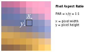
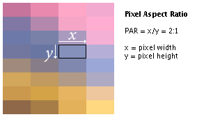
BTW It seems aspect ratio and things like that are a touchy and confusing subject. But pixel aspect ratio is a seperate thing from the screen's picture aspect ratio (such as 16:9, 4:3, etc) actually and non-HD screens could have non-square pixels and that's what they used for MK causing it to be incorrectly shown as more or less 16:10 when uncorrected on a HD screen but was displayed at 4:3 at the arcade.... so playing it in MAME and not setting the screen to 4:3 makes things look fatter than they should be. So displaying it that way (uncorrected) and then cropping it for 16:9 is incorrect.

Again this article for Doom illustrates how the pixel aspect ratio affects the artwork perfectly.
On properly configured CRT monitors, which were the only widely available and inexpensive consumer display device for computers at the time, this video mode took up the entire screen, which had a 4:3 physical aspect ratio. This meant that the 320x200 display, with a 16:10 logical ratio, was stretched vertically - each pixel was 20% taller than it was wide.

The same thing applied to MK although their resolution was a different one it was the same aspect ratio as Doom and was treated the same by the output monitor. So the artwork had wider pixels which where then squashed by the 4:3 monitor to compensate and display it correctly. But yeah Doom and MK where not widescreen originally the pixel aspect ratio was separate from the screen aspect ratio.

So please for the love of goodness don't use uncorrected 16:10 MAME stuff as a reference!
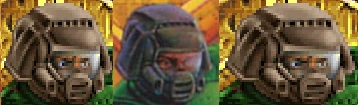
Uncorrected 16:10:
uncorrected.png


Corrected to 4:3 like it was at the arcade:
corrected.png


Or if you prefer comparing just one element here's scorpion uncorrected:
ScorpionUn.png

And Corrected:
ScorpionCo.png


A proper 16:9 version would be the below one except with the width increased rather than the top one with some of it cropped out for 16:9... FYI. Believe me they didn't use 16:10 monitors to display the game and the second shot here is the way it's supposed to look!

From the Doom article:
Widescreen modes add an extra level of complication to the aspect ratio issue. Most modern monitors have a physical 16:9 or 16:10 aspect ratio, rather than the "traditional" 4:3 aspect ratio. In this scenario, the aspect ratio correction should still be performed. The extra horizontal space is properly used by either increasing the horizontal field of view or by simply filling it with a black border, which is referred to as "pillarboxing."

When you are using sprite rips as a reference especially if they where taken directly from the ROM image and not displayed at the correct ratio they are all uncorrected to 4:3.
 
Last edited:
@smoke.tetsu: your "corrected" version is incorrect to me. i played mk1 "my entire life" and i never saw a mk with the graphics streched as your "corrected" 4:3 and i'm not talking only about mame, i play this game since day 1 at arcades.
the first 3 mk games has a resolution of 400x254 wich is close to 4:3 but isn't, is closer to 16:10 just do the math
 
The point is it wasn't widescreen at the arcade and doing the math doesn't give you the right picture. You're confusing pixel aspect ratio with picture aspect ratio. I mean honestly did they have widescreens in the arcade? NO! THEY DID NOT! THE GAME IS NOT CLOSE TO 16:10 AT ALL AND WAS NOT DISPLAYED THAT WAY AT THE ARCADE! IT WAS 4:3!

The uncorrected one was stretched, the corrected one is not stretched.

Sure, my corrected pictures may look different than the uncorrected ones when seen side by side but when you where playing it at the arcade you had nothing to compare it to... it looked normal. Don't believe me? Fine.. but it's a fact. Not an opinion. It's a technical fact and the way CRT monitors worked with their non-square pixels whether you want to believe or listen to me or not.

And please don't get into a pissing contest with me about playing it originally at the arcade since day 1 since I too played it at the arcade since day 1.

These photos show perfectly what I'm talking about with the beveling and the aspect ratio and everything:

http://s1137.photobucket.com/albums/n513/logzone/?action=view&current=IMG_0198.jpg

Picture002.jpg


So if I crop and blow up scorpion from the original arcade monitor and compare it to my corrected and uncorrected images see for yourself which one is the closer to the arcade:

Arcade 4:3:
example.jpg


Corrected 4:3:
ScorpionCo.png


Uncorrected 16:10 just like "doing the math":
ScorpionUn.png
 
Last edited:
do you want facts?
fact: mame display and take snapshots of games at it native resolution, for mk it's: 400x254
fact: fly (a russian guy) rip the graphics straight from the rom itself, not from mame
guess what? the graphics ripped by fly fits 100% with a mame snap

for me 16:10.16 is closer to 16:10 than 4:3 or the same 16:12
 
Again the "native resolution" is not the same aspect ratio as what it was displayed at! SHEESH! The display ratio it was displayed at at the arcade was 4:3 FACT!!!! 10 million times FACT!! The native resolution was made for a screen with non-square pixels and was displayed at 4:3! What do I have to do to make you believe me?

Still don't believe me? Check out this GIF..

With the photo of Scorpion directly from an arcade machine and my corrected to 4:3 from MAME Scorpion alternating:
ScorpionCo.gif


You can't get more conclusive than that. I can't find any higher resolution photos of the arcade cabinet with scorpion on the screen but you can see how he overlays almost perfectly with the game corrected to 4:3 just like the 4:3 monitor the arcade machines had. This is even despite the camera not being perfectly aligned with the screen since the screen is at a tilt. Especially take note of his arms and vest.

The blurrier image is snapped from the photo above and overlaid without any changes other than proportionally scaling it.. I didn't doctor it in any way. All the graphics where meant to be displayed at 4:3 and displaying them uncorrected at 16:10.16 is wrong. It's just a bit more fatter but still wrong. Furthermore the raw sprites ripped directly from the rom are obviously uncorrected as well since the correction is done by the proper RGB 4:3 CRT screen or by MAME when set to 4:3 and there where NO 16:10.16 monitors used in Midway cabinets especially not in their t-unit machines. Do you see a 16:10 monitor here? No?

IMG_0198.jpg


Also notice how the bars where positioned so that they fit perfectly at the top of the 4:3 screen when using overscanning yet when displayed on a modern monitor it showed some space at the top of the screen because that was outside the safe area for the monitors used back in the day.
 
Last edited:
Again the "native resolution" is not the same aspect ratio as what it was displayed at! SHEESH!

So you're arguing that we should stretch a 4:3 picture to 720p instead of running it at 720 natively because "it wasn't widescreen at the arcade". I have an idea, why don't we just add two pixels to each side of the original arcade resolution? Oh and we could use the same sprites from the roms instead of making new ones! It'll be awesome!

We'll call it... "The Extreme HD Kollection".
 
So you're arguing that we should stretch a 4:3 picture to 720p instead of running it at 720 natively because "it wasn't widescreen at the arcade".

Not at all! That's a grave misunderstanding. I'm trying to prevent it from being stretched!

What needs to be done is have the original art corrected for 4:3 for use as a guideline and then visible area added to the sides of the screen showing more of the stage at a given time. In fact I'm arguing the opposite.. it should NOT be stretched. When displayed at 16:10 the original game gets stretched. In fact given a choice I always play the old game in 4:3 with pillarboxing because it was not made for widescreen. So an HD version would be the same as that only with more visible area to the left and right making it widescreen.

I feel like I'm going crazy here with people seeing things opposite of what I'm conveying them as with people thinking I'm suggesting stretching. :\ In fact to be technical the artwork needs to be squashed horizontally a little in order to resemble how it looked on an arcade monitor with the non-square pixels of the original game displayed correctly with the monitor it was made specifically for.

Actually when using the artwork ripped directly from the ROM with no correction or using a 16:10.16 screenshot as a reference everyone arguing against me is actually arguing FOR stretching as that's what you end up with. You either get stretching and the stage cropped at the height for 16:9 or you get stretched and a little bit of visible width added with what others are suggesting here.

That's the irony of this all.. I'm being accused of something I'm against... suggesting it should be stretched.

Although I'm not sure how one would rip sprites directly from the ROM with the pixel aspect ratio compensated for for modern screens. The only advice I can give is to run the game in MAME with the screen setting to 4:3 pillar boxed or take photos from an arcade machine or screencaps from the MKAK. Then compare the proportions of the remake graphics to screenshots from there. That would be the most correct way to do it and of course increase the visible width of the stage. Am I clear enough here now?

The reason why I'm harping on the game being displayed at 4:3 in the arcade is apparently some people here are under the mistaken impression that the game is really a 16:10 widescreen game because of the pixel aspect ratio which was made for screens with non-square pixels. When really it's not a widescreen game and was never displayed that way until the advent of widescreen TVs and computer monitors. Thankfully MAME has a display mode which corrects it to 4:3 and the MKAK was made with it displaying it pillar boxed 4:3 as well.

Although Bleed seems to be making his characters with correct proportions and anatomy so his sprites will probably end up being correct either way at least. That is if someone here doesn't stretch them to fit the proportions of the uncorrected sprites ripped directly from the ROM.

For the characters It'd probably be better to use photos of the actors as guides for the anatomy\proportions and just use the sprites as a guide for the poses so that way you bypass the whole pixel aspect ratio thing. I mean you can't get any better than to follow reality as your guide. Like the side art from the machine would be great as a guide for Johnny Cage's jump kick to get his facial expression and proportions just right:
IMG_0202.jpg


On the other hand some things like the palace guards are currently a little fatter than they should be because they where simply following the exact shape of the original sprites uncorrected. So since the original sprites had non-square pixels and our HD monitors have square pixels they end up being a little wider than they should be. Certain people here simply got used to how they look uncorrected.
 
Last edited:
Well, maybe I'm just retarded but doing anything involving 4:3 outside of supporting it for people with CRT's is a step backwards IMO (and supporting tubes could only involve cutting off the extra background, depending on how we implement the lifebars and/or whether MUGEN is capable of rendering a cropped picture). We have the technology to get the image the way it was meant to be seen - the way it was originally programmed which was something the arcade monitors couldn't do and as such, compressed them - and use that as a base to create a widescreen MK. Correcting a 16:9/10 aspect ratio to a pseudo-4:3 mode would be the opposite of what we need to do.

This isn't directed at you smoke, but to the stretch-supporters. I get what they're saying, but there are other things that need to be taken into consideration.
 
Yeah you aren't understanding what I'm saying like designing it for 4:3 users and not taking advantage of widescreen.

I'm talking about the pixel aspect ratio of the individual sprites and how they where stored in such a way that they display correctly at 4:3 yet when displayed at any other aspect ratio get slightly stretched. I'm not suggesting anything you are saying there at all. Just that the settings of the original need to be correct in order to have the most perfect guidelines for HDifying. After that is done one can simply increase the visible area of the stage and it'd be perfect.

The same thing happened with Doom.. the artwork was tailored for non-square pixels of old monitors and ended up looking fatter on modern screens and it too needed correction. Having the artwork look fatter is not how it was meant to look and not an advantage of widescreen.

You are not retarded but I have to admit it's a difficult concept to grasp that the pixels aspect ratio on a screen could be different than the overall screen ratio like those old screens weren't widescreen but had tall pixels so they had to format the artwork accordingly with wider pixels so when it gets squashed onto the screen it looks correct.

This is what we have now with modern monitors:

PAR-1to1.jpg


This was what was originally used for Doom and MK and what the sprites where formatted for:

PAR-2to1.jpg


So when displaying artwork formatted for the latter it ends up looking slightly wider on the former that it should be and needs some correction. This is seperate from the overall picture aspect ratio which can still have the playing field visible area increased after you correct the pixel aspect ratio of the artwork. This is already being done on modern Doom ports for example which had the same exact thing going on with it. For example:


The image on the right side is uncorrected just like playing the original arcade MK at 16:10 in MAME (I'm not talking about an HD remake at this point). The one on the left is corrected to 4:3 and the middle is taken from the source artwork which matches the corrected version just like my corrected snap of scorpion matches up with the photo from the arcade machine.
 
Last edited:
I'm talking about the aspect ratio of the individual sprites and how they where stored in such a way that they display correctly at 4:3 yet when displayed at any other aspect ratio get slightly stretched.

You'll have to forgive me for not understanding - the sprites aren't getting stretched when run at pixel aspect ratio, those "fatter" images are the actual sprites. Straight from the roms, WYSIWYG. The 4:3 aspect ratio is compressing the image to fit an arcade monitor, hindering the picture as opposed to displaying it the way it was meant to be seen. So 4:3 is the problem not the solution.

I'm not suggesting you're saying anything, I just felt this needed to be said.


Edit- Let me put it to you this way. If you take a picture of MK1, a screenshot not done through MAME itself, running at PAR and look at something that appears "stretched" you'll find that it is actually square.
 
Yeah we'll be going back and forth at this point. The sprites directly ripped from the ROM are the ones formatted so that when they get squashed onto a 4:3 screen look correct. The pixel aspect ratio of them is formatted for 4:3.... not for 16:10. It's like an anamorphic movie on film.. when you look at it on the raw film strip the people look squashed and thin because the lense of the projector is designed to stretch the film to widescreen.

But with games like MK arcade it's the exact opposite... the raw sprites directly out of the ROM are slightly wider than they should be so when squashed onto the 4:3 screen anamorphically it looks correct. It's simply being naturally stretched by the pixels on our modern screens being a different aspect ratio than the ones used on CRT monitors the game was designed for. Because of how the artwork was formatted. This is the individual pixels on the screen themselves.

So saying the sprites just raw out of the ROM are WYSIWIG is like saying a raw frame out of an anamorphic film frame is correct. Example:

anamorphic_film_v2.jpg


You have to understand how and why images are formatted so they look correct on where they are outputted from. Ed Boon and co specifically formatted the sprites for the screens midway used and actually ran it on there while developing it constantly testing on there making sure it looks correct when the non-square pixels get squashed on the screen. They didn't have any other screens in mind nor did they test it out on other screens. So that needs to be taken into account when uprezing the artwork and then after that you can add more visible area to the sides to make it widescreen.

It's kind of hard to explain this sort of thing because it's highly technical and easy to get into misunderstandings. But properly done with compensation for the pixel aspect ratio and with the visible area of the stage increased horizontally you could have it looking like they intended it to and have widescreen at the same time.

Yes it was because of screen limitations of the time that the artwork ended up being formatted a little wider than it should be so when it's displayed at 4:3 it looks correct but that doesn't mean that it's correct on current screens when the artwork is ripped and displayed pixel for pixel without any correction.
 
Last edited:
I'm pretty sure that's not how it works...

I think you're getting the rendering methods mixed up. What you showed in your X/Y example is exactly what's not happening with PAR, which is why I think you're confused. What you said makes sense for other things under certain circumstances, but not in this particular situation.
 
Top