Looking real good.
The model looks great.
I'm at work so don't have the game at hand, but I don't remember her right hand moving back and forth so much though.
That is, the movement of the arm at the shoulder joint I'd think should not be so pronounced.
EDIT:
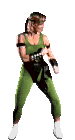
Well, here she is, and in fact. There is never negative space between her right elbow and her body, and the elbow's swaying is minimal. I'd say about half the width of the arm. Her right moves about twice as much vertically as it does horizontally.
Also about the animation:
- In the original both ebows and upper arms sway back and forth almost in unison. See how the apparent distance between her elbows remains almost constant.
- The right fist should have more vertical range, both upwards and downwards.
- The knees should flex a bit more. Notice that there should be a bit more of horizontal motion to her left knee.
- The whole motion should be more fluid, with the whole up/down motion happening at the same speed, instead of kinda falling heavily and slowly coming back up.
Here's the sprite rip in case you can keyframe it.
Now about the model:
- The armbands are too thin and a bit too high on the arm.
- Head should be bigger, torso should be longer, arms should be thicker, and legs should be both thicker and shorter.
- The black "panty thing" (what the hell is that thing called anyway) should go much higher. Look at the width of the strip where the belly is visible. Note that the indentation where the leg meets the body in her hip is visible in the green area before the black starts, and the body remains visible for quite some distance upwards of that.
- Breasts should be bigger and lower.
- Cleavage should be narrower, more v-shaped instead of a square U.
Again, as I always say, don't take this as a bashing.
You're doing great and I'm just trying to help you make it even better.
Keep it up!


")