OK!
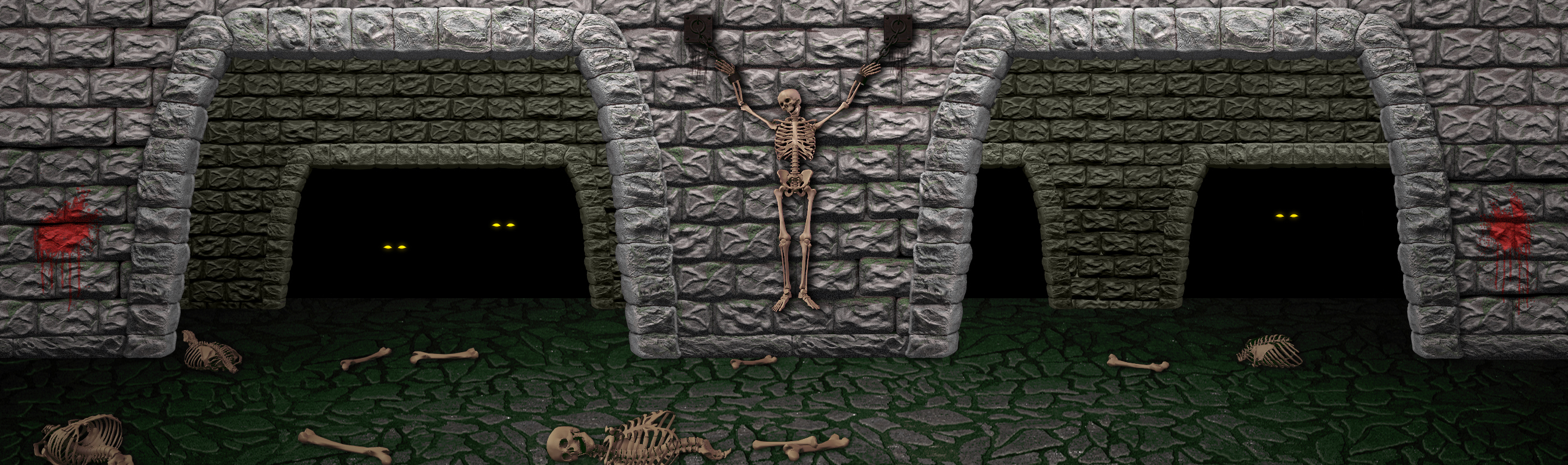
I've addressed everyone's concerns from having too much green in the floor to removing all shinyiness in the bricks (I actually remodeled them and they are much more realistic now. Also added in some grain to make them feel a bit rougher. I'm not sure how much more I can massage this. It doesn't look exactly like the original, but it is about as close I'm going to get it I think.
Result is here:


")