Mortal Kombat HD Remix with MUGEN

@Bleed, here's this.
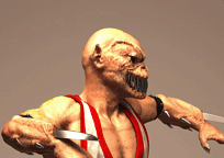
I matched the nostrils and the chin.
This is not to be taken as a reference in size.
The head should be larger since Divizio's head would certainly not fit in there, but the shape, leaving minor deformations due to having the guy's head in it, should mostly match.
I guess you initially matched your model to this profile, but slowly drifted away while trying to adjust things.
It tends to happen.

The cheeks should move forward, which would make the face flatter and the mouth narrower.
His cheeks should probably be more pronounced and a bit higher too. Notice how prominent they are, pushing the eye sockets forward. The edge around his eye sockets should be more pronounced.
As it was noticeable in his victory pose, his dome is not supposed to be so tall.
Also that dent in his temples should be smaller, his ears should go forward, and the shape of the back of the jaw should be corrected.
BRKHead.gif

This one, although not as useful in matching his features, is more head-size-conscious and shows what it could look like.

BRKHead2_zps585b5269.gif~original
 
Last edited:
Thanks to "Bleed" and "arq_hawkin" for their impressive works
and thanks to "uKER" for his precision and useful posts .
:flowers:
 
Bleed aside from what uKER pointed out, I think you'll need to do a "teeth" light which will only illuminate the teeth.

@Bleed, here's this.
I matched the nostrils and the chin.
This is not to be taken as a reference in size.
The head should be larger since Divizio's head would certainly not fit in there, but the shape, leaving minor deformations due to having the guy's head in it, should mostly match.
I guess you initially matched your model to this profile, but slowly drifted away while trying to adjust things.
It tends to happen.

The cheeks should move forward, which would make the face flatter and the mouth narrower.
His cheeks should probably be more pronounced and a bit higher too. Notice how prominent they are, pushing the eye sockets forward. The edge around his eye sockets should be more pronounced.
As it was noticeable in his victory pose, his dome is not supposed to be so tall.
Also that dent in his temples should be smaller, his ears should go forward, and the shape of the back of the jaw should be corrected.

View attachment 5720

This one, although not as useful in matching his features, is more head-size-conscious and shows what it could look like.

BRKHead2_zps585b5269.gif~original


another one, trying to make it look natural, see any changes bleed? I applyed the movements needed and than tone it done.. or at least, tryed to hahaha LOL


another one, trying to make it look natural, see any changes bleed? I applyed the movements needed and than tone it done.. or at least, tryed to hahaha LOL
That looks great.
The body animation looks great.
I'd only get rid of the head whipping altogether, and simply make the head sink between the shoulders a bit when he falls (shorten the neck).

The pants however still look iffy like Le@n said.
Also, I think you should make the waist be an elastic strip tight to his body and not puffy as it currently is, and from there it should loosen gradually downwards, trying to keep it from looking inflated.
Again, this is the look I think you should be going for, minus the elastic strips at the bottom of the legs:

6294953_1_l.jpg
 
Last edited:
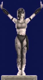
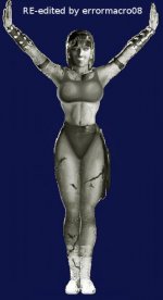
Alright, for the heck of it, here is my new version of the Sonya-staue. I tell you, it's not that easy to adapt a low-res image to hi-res.
You tell me which one you like better.


[table="width: 500, class: outer_border"]
[tr]
[td]Sonya de piedra RESTYLING.gif[/td]
[td]mkya0004changed.png[/td]
[td]Sonya de piedra New6.jpg[/td]
[td]Sonya de piedra New7.jpg[/td]

[/tr]
[/table]


I did this for my long-legged version. If necessary, I can easily adapt those changes over to the original short-legged version.

Cheers,
EM08
 
Arq, maybe you can try using the morpher to make the pants match better with the fight stance.

Blend it out at the start and back in at the end, so you don't get a pop. I'm guessing here, because I don't use the cloth system. Using the cloth simulation all the way is always going to pop when switching to other animations.

The legs clipping through the pants can be fixed by adding a transparent material to that area, 0 opacity, 0 specularity. A masking material basically to hide the legs.
 
Wow, with thous eyes she looks much happier! :)

About Liu Kang - please, look at the folds on his right leg. I think, the first frame and the last frame of animation looks different.
 
I just spent some time hacking that Sonya away.
I'm nowhere near being fond of the result, and there's still stuff that's wrong but I didn't bother to fix, such as the belt and the position of the armbands.
This only goes to show that by eyeballing this kind of stuff you almost guarantee yourself that you won't get a true likeness to the original.
Proportions, positions, shapes... Subjectivity messes it all up.
In Photoshop this comparison is particularly easy to do by using layers, so why not do it?
Also, sorry to say it, but the face was terrible.
Not that mine is a whole lot better either.

Sonya_zps6fa0557e.gif~original
 
Last edited:
Thanks for the comments, guys, at least I got some feedback now!

to KOMBAT, I just pretend that you meant this as a compliment for my Sonya-Statue! ;)

to uKER, Wow, I see now that you got these big and very good looking changes within a short time, while I worked 2 days on it. I like your changes a lot! So your skill in drawing is more than a multiple of mine! But I also agree, eyeballing stuff is not easy, even more so when you have to adapt low-res to high-res where you have to create the missing pixels from your imagination. I know that there's a whole lot more to fix in my version but I initially wanted to fix the most striking ones, then deal with the rest. I didn't think about using layers, maybe I'm gonna check that out next time I open my drawing tool, GIMP.
And I understand, what looks good to one person, might not look good to another. And since the focus of the team was to make it as close to the original as possible, for me it's even more difficult, as what looks good to me isn't matching with the original. I also think you can only come very close to the original, when you have the model in many different positions, as what might look matching to the original in one pose, might look totally off when the model is in another pose.
Hmm, we disagree regarding the face, I liked it a lot even though I knew it was a bit pixelated and not smooth, but again, this was not that close to the original, either, so the same problem here.
I think I'm putting in a pause from drawing the statue for awhile, as my skills are probably lacking and I would probably stray too far from the original.

I just really hope, that the original creator of the Sonya model, Chris Berserk, sees this, can make at least some use of this, and
hopefully gets a drive to post more new Pics of his awesomely-done Sonya in response! ;)
 
Don't get discouraged by my comments and stop drawing.
Practice makes perfect.
I just wanted to point out that eyeballing will most certainly not get you far.

Sent from my Nexus 4 using Tapatalk 4
 
Top