Mortal Kombat HD Remix with MUGEN

@MrMos3s
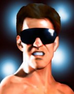
Any updates on Goro or Kano coming soon? Are you still working on Lui's character select portrait? Have you started messing with the blood sprites?


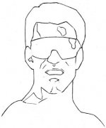
I've got a real good start on the Liu Kang portrait, I'll try to at least get him possibly done tonight after I get the kid to bed. I could get going on anything afterwords, is there anything specific you'd like me to put at the top of the list? Thanks for keeping up, btw :top:
 
I've got a real good start on the Liu Kang portrait, I'll try to at least get him possibly done tonight after I get the kid to bed. I could get going on anything afterwords, is there anything specific you'd like me to put at the top of the list? Thanks for keeping up, btw :top:

Can you work on Kano's Ending? I know you started on it but never had the chance to finish. (after Liu's Portrait)
 
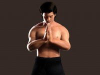
and about Uker's comments, I really appreciate that he took the time to write such a detailed comment, I just have to ask to him to be a little easier with this, painting in photoshop is not like making a 3d model, there are some things like 20º narrower that will be just impossible to see when the portraits gets up to scale and color reduction.

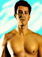
according to uker's comments here is what I did, there are some other things that will have to be fixed in photoshop like forehead's hair angle, some highlights and some other minor things but it will be a piece of cake for MrMos3s
arq, I don't want you to take my comment as criticism.
I wouldn't bother commenting on them if I didn't think you had a good starting point.

About your new image, I'd say it's a DEFINITE improvement.
The hair is -SO- MUCH better, and so is the lighting and the mouth.

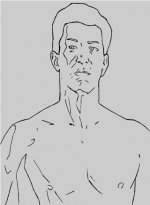
I only miss a correction in the body's position, which I'd say is not something easy to fix in Photoshop.
In the original picture, he is quite close to his body facing the camera, and in yours the angle is I'd say double.
See how in your picture the right shoulder (left in the picture) is almost invisible?

If you can pull this off, I'd say you'd have something that would come real close to the original with just very light Photoshopping.
 
Last edited:
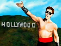
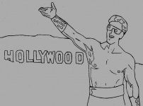
Liu Kang looks really good in his ending picture now. But that background has to be zoomed in on big time if it's going to match the original.
 
Last edited:
Liu Kang looks really good in his ending picture now. But that background has to be zoomed in on big time if it's going to match the original.

thanks, and yes I know, I'm not working with the background, MrMos3s will do that when the portrait it's done
 
arq, I don't want you to take my comment as criticism.
I wouldn't bother commenting on them if I didn't think you had a good starting point.

About your new image, I'd say it's a DEFINITE improvement.
The hair is -SO- MUCH better, and so is the lighting and the mouth.

I only miss a correction in the body's position, which I'd say is not something easy to fix in Photoshop.
In the original picture, he is quite close to his body facing the camera, and in yours the angle is I'd say double.
See how in your picture the right shoulder (left in the picture) is almost invisible?

If you can pull this off, I'd say you'd have something that would come real close to the original with just very light Photoshopping.

thanks uker, I'm not taking it as criticism but as great comments, you have good eye to find this kind of things, keep on with that great eye
 
Nice work, Liu Kang looks very good here! New hair created much better and realistic.
I think, will be good if you also make Tsung model.
 
Last edited:
View attachment 5282

here is my shot with the second ending pic.. if somebody here can provide the background it will be so helpfull...thanks
Whoa. That is excellent.
You are really getting it there.
His face, hair and hands are looking great, and the lighting is also quite close.

Suggestions in case you want them:
- His arms and hands should be thinner, more nimble. Look at the girth of his wrists. The curve on top of his forearms should be more concave than convex. His shoulders also look too swollen, especially the one on the right of the picture. I think most of the problem is that the shoulder muscle is not supposed to reach that far down the arm.
- His chest muscle should reach a little lower. See how the end of it is seen between the lower part of his hands in the orginal. This in turn will move the nipple to where it's hidden by the forearm, and allow the belly button to be moved down, just under the pants' line.
- His head should be a little narrower.
- His hands should probably be a bit further from his chest. Changing this will probably make the light/shadow across the stomach match if the light on the right is high enough.
- Once his hands are a little further, they should be rotated so that his fingers point more towards the face.
- In the original, the elbow on the right side of the picture is posed a bit higher and further away from the body (see negative space between elbow and body)
- The light coming from the left looks like the height is right, and it would be fine if only it was a tad closer to the camera (look at highlights on forearm and left side of stomach)
- The waist part of the pants is supposed to be a separate area, much tighter than the lower one.

Again, I expect you to take my increasing pickiness as a sign of you getting close to perfection, instead of me just trying to point out defects.
Keep up the great work!
 
Last edited:
Wow arq_hawkin nice job! Besides what was already mentioned to be fixed this is really looking good. You re skills are improving nicely.
 
3.jpg

hello again, here is my update with ukers and others comments...

@la_luna, really helpfull, maybe next I'll work on TYM animation
 
Really nice change.
The body proportions are looking pretty good.
Now I'd only tone down the "oiliness" a notch or two and it's a go for me.
Really nice work, arq.
 
Last edited:
Really nice change.
The body proportions are looking pretty good.
Now I'd only tone down the "oiliness" a notch or two and it's a go for me.
Really nice work, arq.


YES, I realized about that oiliness too, I'll fix it for the final, I didn't render it again cause I had to get to work, I did this changes in the office LOL
 
Top