Mortal Kombat HD Remix with MUGEN

I totally love your music by the way...! :hail:


Thanks a ton, man. :) It always makes me smile when someone likes the music, just cuz it was a ton of work and a lot of the time I had to make choices that deviated from the originals a bit. I'm glad people still get the MK vibe from it.

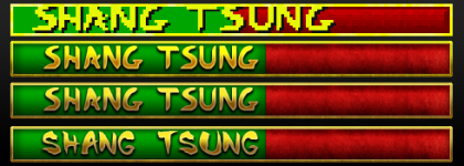
Here is the updated set of lifebars with the edited version at the bottom.

EDIT: Forums are attaching these things weirdly.
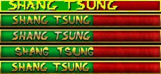
MKHD Healthbar Set 4.jpg


EDIT EDIT: The board is making them look kinda crappy to my eyes so I'm gonna add an external link also. Here ya go:

http://www.mediafire.com/view/?5vz75enboaarr68
 
Last edited:
Thanks a ton, man. :) It always makes me smile when someone likes the music, just cuz it was a ton of work and a lot of the time I had to make choices that deviated from the originals a bit. I'm glad people still get the MK vibe from it.

Here is the updated set of lifebars with the edited version at the bottom.

EDIT: Forums are attaching these things weirdly.

View attachment 4771


EDIT EDIT: The board is making them look kinda crappy to my eyes so I'm gonna add an external link also. Here ya go:

http://www.mediafire.com/view/?5vz75enboaarr68


I vote for the bottom one to be final, love the brightness and sharpness of it.
 
Yeap but the colors could be closer to the original... I would like Justin to take a look again at the example I provided in the previous page.
 
I vote agree bottom one looks best. Mr.Mos3s you can find blood files in MK1HD folder on the server. l think I zipped it up, let me know if you dont see it.
 
Hi, MrMos3s :)
Carz is talking about the colors, I think green specifically.
In justin's last update the colors are a little bit off. Green value is at #00a82b, while original was #00a500, this make's it look a little blue/aqua compared to the original. Red is not as noticeable due to it being a "grain-gradient" from #6b0000 to #d60000.

I am really impressed by the work and effort put into this. I want to state so many things, but I just can't find the right time to do so.
I'll post some of my thoughts soon enough. I know I am not part of the team behind this, but certainly I care for this project... a lot.


I think Carz may have meant the brightness of the yellow parts, and it appears to me that Justin did take Carz suggestion in his latest revisions.

Carz version is actually the bluer one, but I can completely understand accidentally mixing the images up after downloading them from the forum. The difference in the greens could have easily just been from the compression of the JPG/PNG file itself as well, Carz and Justin may have saved/exported them differently from their photo software, otherwise Carz would have to be quite picky to want Justin to make that barely noticeable change to a bluer version.

CLICK TO OPEN FULL SIZE/BETTER QUALITY
comparison.jpg

Great eye and detective work though, and thank you for the kind words!
 
Last edited:
If I may offer a critique I think the kerning on there is too tight and perhaps the font size is a tad too small too. Although (about font size) if you want to avoid the touching the original has at the top of the font to the border I can understand that. The original had looser kerning but less padding between the name & the border. The font itself may not be as wide too (in your remake... the original looks like it may have wider letters) although I'm not sure that's because of distortion in the original. Either way it's apparent the name doesn't fill the same space as in the original.

I have to say though the part I like best about that version is the border around the life-bar.

Also as amusing as the "fun font" is I say stick with the original font. The fun font is a bit too comical for MK. :)
 
Last edited:
New update. The second from the top has the original colors. In my opinion, THAT yellow next to THAT green looks kind of sick/pukey to me. The third down looks classier and less fake/"cheap" to my eyes. The bottom has the fun font that makes me smile. haha

View attachment 4773

External link for better quality: http://www.mediafire.com/view/?rtl4dxpi12avet9


I like your first one (I think it's the one you don't like lol) but I like them all, and I agree with Smoke about keeping the original font. Smoke also has a good point about the kerning, maybe stretch + spread the letters a bit because once we have a short name like Kano on the life bar it'll probably end up looking pretty small, maybe not though.
 
Last edited:
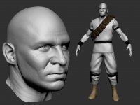
I'm going to upload the ztool of what I have of Kano to the dropbox tonight. I have everything unwrapped except for the pouches (unless they're already unwrapped, didn't check) and the knife sheaths. So if anyone wants to grab him to start rigging or whatever, go for it.

19.jpg
 
The difference in the greens could have easily just been from the compression of the JPG/PNG file itself as well, Carz and Justin may have saved/exported them differently from their photo software...

yeah, actually I didn't think of that at the time, workspace profiles can greatly influence colors and tones.

Great eye and detective work though, and thank you for the kind words!
:) it's the least I can do for such an incredible project.


The third down looks classier indeed, I like both second and third ones. Don't really feels sick or pucky to me so it's your call.
On a side note, can you lessen the shadows on the green part just a little bit? just to convey a little more that green is what fills the lifebar, and red shows its emptyness. Or maybe it can be done in other way, just a small opinion. Great work BTW :)
 
Justin, If you count the original lifebar as first then I like second and third.
I don't like the red part, looks like too much noise IMO
 
Hey Justin,

I agree with pretty much everything everyone is saying here. I like either the second version or the third version. Smoke's comments are dead on here though about kerning and the font width being distorted a tad. Also agree that the font size could probably be a 1pt larger.
Please let me know when you'd like to upload your file into Dropbox (when you feel done with it) and I'll incorporate into the UI file.

I disagree with Interloko about red looking like noise for noise sake though. It looks pretty cool I think. But if you'd like to try an alternative, perhaps the red area is velvet like the title screen background. Maybe something like this: fotobg.ru/upload/img1350122104.jpg
 
Awesome Gojira,

Pouches were not unwrapped. Nice work man!

Are you going to go back and tweak Sonya next?


I'm going to upload the ztool of what I have of Kano to the dropbox tonight. I have everything unwrapped except for the pouches (unless they're already unwrapped, didn't check) and the knife sheaths. So if anyone wants to grab him to start rigging or whatever, go for it.

View attachment 4775
 
Top