You are using an out of date browser. It may not display this or other websites correctly.
You should upgrade or use an alternative browser.
You should upgrade or use an alternative browser.
Mortal Kombat HD Remix with MUGEN
- Thread starter Spawn16
- Start date
I don't know what else to say. It's a lot of work for me to change what I have already and this new version DOES look cheap. Maybe because I've been working in graphic forever, I have a different perspective than you. It reminds me of what happens when someone new to Photoshop learns how to use the Gradient overlay to make everything look shiny. It isn't subtle. It is like 1990's candy button mac-era shiny and glossy. The multi-tone gradient is distracting. The dark shadow lines make it look hand drawn. It's more Street Fighter than Mortal Kombat. I did say that the one thing I like which I feel was done pretty well is the gold gradient in the actual letters. You can tell the blurry reflection in the letters was hand painted. But it is blurry as hell, especially on high resolution color calibrated monitor. Take a look at what they did for MKHD which was cancelled. That's how you do it. No real shininess but the letters have a depth to them.
About Version 1:
View attachment 4751
I purposely left the yellow win dots out. It's mostly just a mockup of the lifebar itself and not something taken from in-game or anything. I'm not going to create the dots either unless I'm given the go-ahead... or someone else makes them like UnrealWins. Would be no use for a mockup that wont be used.
Also, as far as the critisism goes I might agree that it was looking a tad blurry (but not AS HELL) there as what sometimes happens when one scales down stuff and the forum may have messed with the scaling too. However, cheap is kind of a hurtful criticism I would say. I did however make a second revision mockup.. sorry still no yellow win dots here...
Revision 2:
View attachment 4754
I toned down the shinyness a bit as per Cal's criticism and tried to make it "sharper". I do like some level of shininess though and I think it looks sharp enough. If anything I think it's the best bar for an HD remix so far. Most others are way too plain or have the wrong size fonts, etc. which to me is the cheaper look to be frank. There's nothing subtle about the plain yellow red and green bar in general especially when it's flat shaded.
Revision 3:
View attachment 4756
I did a bit more as far as toning some of the aspects down a bit and added in the noise to the empty part of the bar.
Also I'd be willing to help out changing the names over if a certain person here doesn't want to do all the work. Especially if UnrealWins helps out too providing elements like words and such... or not.. I actually think it shouldn't be too hard to go from what's in there now to this especially since it uses pretty much the same shapes for the words which are already there. Plus the names & lifebar elements are separate which helps.
WOW! Beautiful work Gojira. As Bleed said, your sculpting has improved greatly. This is impressive work. Only thing I see is the same as what others have said in that his skin is a bit too tan.
What Bleed said.
Thanks Rene, and yeah, it should be a bit lighter. I'll work on that.
Here are some test renders from Maya. See some odd artifacts under the nose and some lumpiness that should be smoothed away. Will work on those later though. Kinda tired now:
View attachment 4757
Last edited:
smoke.tetsu
New member
Revision number 4
Shine:
Semi-Gloss version 5:

Went back and redid it from "scratch" due to scaling issues that where somehow introduced earlier. It shouldn't look any less sharper than it should be now.
Whatever you say chief. I could have some unkind things to say about the current stuff you have like the gradient border you have around your lifebar but I wont as I'm better than that. Plus, could you be any more condescending? You don't know what kind of background I have and I'm just trying to help out with visualisation and I even offered more (help) if nessasary.. but this seems to be one of those times where it's a matter of pride particularly for you.
I've seen a lot worse than this when it comes to remakes. Perhaps this is something that could be put to a vote.
Also, one doesn't have to accept everything from this or nothing.
I agree that this looks nice as an MKII lifebar but I don't agree that the shading on the letters is any better. Additionally this resembles the MK HD kollection more than it does Street Fighter HD Remix. It's funny that you say it looks 90's era because well.. what era do you think MK came from?
.... anyway, I agree Kano's head is looking great.... a tad plasticy maybe but great otherwise! The resemblance to Richard Divizio is uncanny.
Shine:
Semi-Gloss version 5:
Went back and redid it from "scratch" due to scaling issues that where somehow introduced earlier. It shouldn't look any less sharper than it should be now.
I don't know what else to say. It's a lot of work for me to change what I have already and this new version DOES look cheap. Maybe because I've been working in graphic forever, I have a different perspective than you. It reminds me of what happens when someone new to Photoshop learns how to use the Gradient overlay to make everything look shiny. It isn't subtle. It is like 1990's candy button mac-era shiny and glossy. The multi-tone gradient is distracting. The dark shadow lines make it look hand drawn. It's more Street Fighter than Mortal Kombat. I did say that the one thing I like which I feel was done pretty well is the gold gradient in the actual letters. You can tell the blurry reflection in the letters was hand painted. But it is blurry as hell, especially on high resolution color calibrated monitor. Take a look at what they did for MKHD which was cancelled. That's how you do it. No real shininess but the letters have a depth to them.
Whatever you say chief. I could have some unkind things to say about the current stuff you have like the gradient border you have around your lifebar but I wont as I'm better than that. Plus, could you be any more condescending? You don't know what kind of background I have and I'm just trying to help out with visualisation and I even offered more (help) if nessasary.. but this seems to be one of those times where it's a matter of pride particularly for you.
I've seen a lot worse than this when it comes to remakes. Perhaps this is something that could be put to a vote.
Also, one doesn't have to accept everything from this or nothing.
I agree that this looks nice as an MKII lifebar but I don't agree that the shading on the letters is any better. Additionally this resembles the MK HD kollection more than it does Street Fighter HD Remix. It's funny that you say it looks 90's era because well.. what era do you think MK came from?
.... anyway, I agree Kano's head is looking great.... a tad plasticy maybe but great otherwise! The resemblance to Richard Divizio is uncanny.
Last edited:
Interloko, all the files are updated on dropbox. I think you mentioned that your app is linked up so it should start downloading the stages for you. I made some corrections to the size of the guards on the Courtyard stage per some comments that were made here.
Here are a few target renders of what I'm hoping the game can look like.


Here are a few target renders of what I'm hoping the game can look like.
Can we just agree to disagree? When you are right, I support you. In this case it is a matter of opinion. I disagree strongly. I have 14 years as a Creative Director and a degree in Visual Arts to back me up. What you call condescending, I call confidently stating my opinion. Have I not earned the right to be honest? You keep picking everything I'm saying apart as "hurtful" or "condescending" when all I'm doing is stating my well informed opinion. I'm sorry if you disagree. I don't claim to be right about everything, but I DO feel strongly about this. And please stop painting this picture of me as too proud or too lazy because I don't agree with your opinion. I'll guess the "chief" bit was on purpose to prove just how condescending I am right? I'm not out to hurt anyone's feelings with my comments. Saying something looks cheap because it is shiny is 100% factual and legitimate criticism. I could have used the words gaudy, or horsey as well but somehow I think any opinion different from yours would be perceived negatively.
Revision number 4
Shine:
Semi-Gloss:

Went back and redid it from "scratch" due to scaling issues that where somehow introduced earlier. It shouldn't look any less sharper than it should be now.
Whatever you say chief. I could have some unkind things to say about the current stuff you have like the gradient border you have around your lifebar but I wont as I'm better than that. Plus, could you be any more condescending? You don't know what kind of background I have and I'm just trying to help out with visualisation and I even offered more if nessasary.. but this seems to be one of those times where it's a matter of pride particularly for you.
I've seen a lot worse than this when it comes to remakes. Perhaps this is something that could be put to a vote.
Also, one doesn't have to accept everything from this or nothing.
I agree that this looks nice as an MKII lifebar but I don't agree that the shading on the letters is any better.
.... anyway, I agree Kano's head is looking great.... a tad plasticy maybe but great otherwise! The resemblance to Richard Divizio is uncanny.
Revision number 4
Shine:
Semi-Gloss:
Went back and redid it from "scratch" due to scaling issues that where somehow introduced earlier. It shouldn't look any less sharper than it should be now.
Whatever you say chief. I could have some unkind things to say about the current stuff you have like the gradient border you have around your lifebar but I wont as I'm better than that. Plus, could you be any more condescending? You don't know what kind of background I have and I'm just trying to help out with visualisation and I even offered more (help) if nessasary.. but this seems to be one of those times where it's a matter of pride particularly for you.
I've seen a lot worse than this when it comes to remakes. Perhaps this is something that could be put to a vote.
Also, one doesn't have to accept everything from this or nothing.
I agree that this looks nice as an MKII lifebar but I don't agree that the shading on the letters is any better. Additionally this resembles the MK HD kollection more than it does Street Fighter HD Remix.
.... anyway, I agree Kano's head is looking great.... a tad plasticy maybe but great otherwise! The resemblance to Richard Divizio is uncanny.
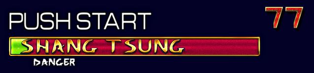
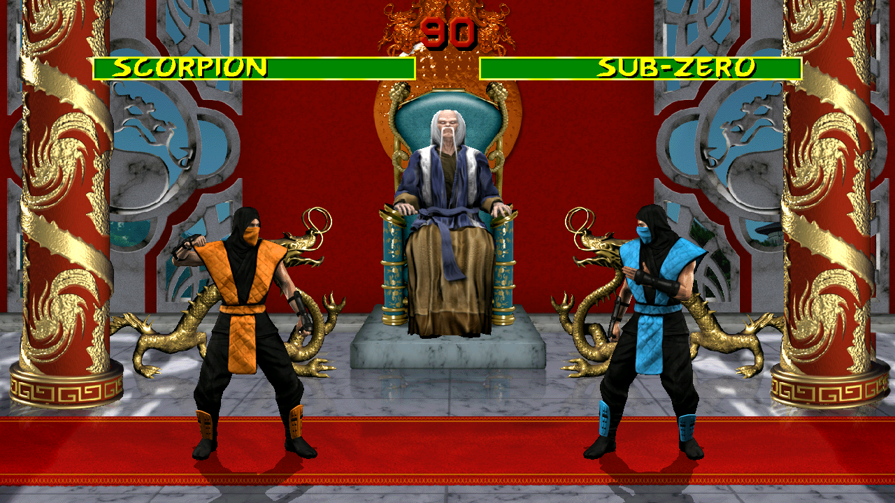
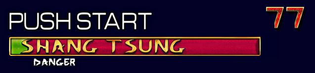
Nice work Bleed") Probably need to shrink down Shang a litte bit so he doesn't look 9 feet tall though.
Probably need to shrink down Shang a litte bit so he doesn't look 9 feet tall though.
Edit: Maybe Shang and the Chair itself can be a bit smaller. What do you think?
Oh hey I also notice Subzero's text is spaced pretty far from the right edge of the power bar. I wonder if it would be difficult to set P2 character text spacing based on character name?
Probably need to shrink down Shang a litte bit so he doesn't look 9 feet tall though.Edit: Maybe Shang and the Chair itself can be a bit smaller. What do you think?
Oh hey I also notice Subzero's text is spaced pretty far from the right edge of the power bar. I wonder if it would be difficult to set P2 character text spacing based on character name?
I made another font file for the timer, added the victory dots, not shown here. Fixed the visual scale problems, now it's just some velocity settings that need to be adjusted.
Last edited:
smoke.tetsu
New member
Well, if you want to be completely honest not everything you have done looks very professional especially when you first started out on this project. At first you did exactly what someone is NOT supposed to do when doing a high res update which is take the original sprites and draw over them 1:1. That's not something someone with 14 years of creative director experience would do. That's amateurish. Your life-bars still suffer from this somewhat especially in the lettering department... your timer numbers look good though.
Thankfully most of the other stuff that's been done avoids that especially the 3D modeling work as of late.
Saying something is cheap or gaudy or whatever adjective you want to use that's similar is a matter of taste or opinion not fact. Also I have to wonder if you are the gatekeeper for this entire project and only your tastes & views on it matter.
I said from the very beginning that I was new to zBrush which is 3D modeling software. I even promised you I'd go back once I improved my skill set to fix it and I did. 14 years of Creative Direction doesn't necessarily mean I'm a master of 3D now does it? But do you know what I am a master of? Critiquing 2D graphics. So yes, my opinion should hold some weight. Didn't I just say it was my opinion? Why are you regurgitating what I'm saying and spitting it back at me? Lets just agree to disagree. Fair?
Well, if you want to be completely honest not everything you have done looks very professional especially when you first started out on this project. At first you did exactly what someone is NOT supposed to do when doing a high res update which is take the original sprites and draw over them 1:1. That's not something someone with 14 years of creative director experience would do. That's amateurish. Your life-bars still suffer from this somewhat especially in the lettering department... your timer numbers look good though.
Thankfully most of the other stuff that's been done avoids that especially the 3D modeling work as of late.
Saying something is cheap or gaudy or whatever adjective you want to use that's similar is a matter of taste or opinion not fact. Also I have to wonder if you are the gatekeeper for this entire project and only your tastes & views on it matter.
Hattoris
New member
Okay... I *LOVE* seeing all of the work on this, but I hate not having much skill when it comes to creating anything like this.
*HOWEVER*, I do a ton of video editing for work. Is there any chance, when the game is at least close to completion, that I could create an "announcement trailer" for the game? I would just need someone like Bleed, Interloko, etc to record a fight between different characters in every background as well as send the HD headshots of each character and I could whip up a pretty decent fan trailer once the game is complete!
I just want to be able to help in some capacity!
smoke.tetsu
New member
I said from the very beginning that I was new to zBrush which is 3D modeling software. I even promised you I'd go back once I improved my skill set to fix it and I did. 14 years of Creative Direction doesn't necessarily mean I'm a master of 3D now does it? But do you know what I am a master of? Critiquing 2D graphics. So yes, my opinion should hold some weight. Didn't I just say it was my opinion? Why are you regurgitating what I'm saying and spitting it back at me? Lets just agree to disagree. Fair?
Well, I'm going to conclude in saying that for example I did not just fill in the border with a gradient and call it a day.. It's much more complicated than that and I think it looks quite good in fact I'm especially pleased with how the bottom right corner came out. But I see that I'm stepping on your toes here and you really want to keep the stuff you already did... I will apologize for any negativity on my end but I do think you are lording your 14 years of creative director experience over me a bit too much and you said some of your opinions are 100% factual.... I could have been a lot more harsh on everything you have made but I chose not to because I know you are\where doing your best.
Le@N
Member
http://www.youtube.com/watch?v=hx292crZnsIbackground is only one picture that moves left and right.
You'll notice difference in previous video. Here was 2 layers with different movement.
Hey you don't have to pull punches with me. If you think something looks bad, say it. But always say why and be as specific as possible or else it isn't very constructive. I lead a team of 6 mid, junior and senior level graphic artists for my day job and I try to be fair and honest without being a total jerk. It can be very difficult to say what needs to be said if you are constantly worried about hurting someone's feelings. I've also worked on things for days or even weeks to have my boss (usually an ECD -executive creative director or GCD -group creative director) tell me it was absolute garbage. So yeah, I've built a thick skin and I guess I sometimes incorrectly assume everyone else has too. Anyway, lets move on from this. No harm, no foul just differing opinions.
Well, I'm going to conclude in saying that for example I did not just fill in the border with a gradient and call it a day.. It's much more complicated than that and I think it looks quite good in fact I'm especially pleased with how the bottom right corner came out. But I see that I'm stepping on your toes here and you really want to keep the stuff you already did... I will apologize for any negativity on my end but I do think you are lording your 14 years of creative director experience over me a bit too much.... I could have been a lot more harsh on everything you have made but I chose not to because I know you are\where doing your best.
smoke.tetsu
New member
I just want to lay down the gauntlet now then. If you think mine and UnrealWins life-bars are terrible then come up with a better more classy one. To be honest the current ones look like bare minimum effort done in high res remaking. If you do that I'll gladly eat crow.
Also, I'm not sure this is the most opportune time to say this but since you asked. I'm sure the blood in your full screen mockups is placeholder and or WIP? It's looking pretty cartoony & like drawn over rather than remade\redrawn.
Also, I'm not sure this is the most opportune time to say this but since you asked. I'm sure the blood in your full screen mockups is placeholder and or WIP? It's looking pretty cartoony & like drawn over rather than remade\redrawn.
Last edited:
Agreed with Bleed words. The Principal goal is finish the game at close with can to the original MK1.
If other users want to still working on it, can be a remix version or whatever name you want to use with extras like new UI, more moves, stages updated...
But this depend if users want to make it or not.
If other users want to still working on it, can be a remix version or whatever name you want to use with extras like new UI, more moves, stages updated...
But this depend if users want to make it or not.
DjangoJustin
New member
I think the current user interface needs a good looking at. To me, there's a big difference between staying close to the original and making something that looks like the original pixels scaled up. Bleed didn't do that and we are all glad for that. Right now the UI just doesn't match Bleeds level of quality and looks pretty drab overall.
I hope Im not offending anyone here.
I hope Im not offending anyone here.
smoke.tetsu
New member
User mods or 1.5 versions by other people other than the core team is going to be difficult though considering this project is going to be moleboxed and not editable. So all this MK 1.5 or remix or whatever stuff isn't really material. Considering the project at the end is not going to be editable I think we can forget about mods & 1.5 versions pretty much.
BTW if anyone cares I put one more revision... also edited into my former post...

#6:
I tried accomodating Cal's "critique" into it while keeping what I felt was the strengths of it but I just know him and other purists will not like it. But this is less shiny and I did try. I'd be suprised if purists would like an HD remake in general though to tell you the truth.
Which is a little ironic because he has a long history of making stylistic changes in his sprites for example.
BTW if anyone cares I put one more revision... also edited into my former post...
#6:
I tried accomodating Cal's "critique" into it while keeping what I felt was the strengths of it but I just know him and other purists will not like it. But this is less shiny and I did try. I'd be suprised if purists would like an HD remake in general though to tell you the truth.
Which is a little ironic because he has a long history of making stylistic changes in his sprites for example.
Last edited: