Mortal Kombat HD Remix with MUGEN

Hi Justin, I have few suggestions for the Gallery. Maybe you can place the characters as they are in the select screen, or even better, put the actual select screen.
For the stages probably look better if you put them in order: Courtyard, Palace Gates, Warrior's Shrine, Pit, Thorne Room and finally Goro's Lair.

@Bleed: Awesome work as allways man!! You are very very quick right now and animations looks impressive, very close to arcade.
Maybe you can check later some of the first animations and tweak them a little bit. Now blocking is looking weird to me lol.
I said to Calactyte that I'll have more free time soon. Yesterday I was updating my mugen files (there's a new alpha) and fixing/checking some stuff.
Expect some from me in Dropbox next month.
Sorry about my no presence here.
 
Uhm.. Guys! I have an idea, but I'm afraid that it won't work or maybe it won't match up to the HD Remake, or to promote it. I am thinking that making a CGI video could be a good teaser for the fans of this project, or maybe it could be part of the game as an attract mode instead of showing gameplays before the player starts the game. .

I know it is very tough, hard, rough, and exhausting to do, and I know some of here might disagree, but in the end it's still an idea though. . .^_^
 
I like the idea of a Full motion video, but that will take too much time from the meat of the project. Would be really cool to do something like that though.
 
Ok, got a lot of stuff updated on the page. The active portraits are now clickable, leading to an assets page for the character. If someone could look specifically at Scorpion's Assets list and tell me if it's accurate that would be awesome. Also, any feedback about the site's layout etc. is welcome.

Also changed the stuff interloko suggested. Thanks!

http://mortalkombathdke.weebly.com/

EDIT: Ok, now Scorpion, Sub Zero, Shang Tsung, and Goro all have updated Asset pages. If anyone can check them and confirm that they are accurate, that would be great. I think I got 'em right, but I'm not 100% sure what's been completed.


Also @Bleed, I threw up a Scorpion Standing animation on his gallery page. Hope that's cool. I'd like to eventually put a piece or two of development art up on all the character's gallery pages too. Any thoughts about that idea?

@ MrMos, can't wait to see that Goro portrait, sir! His stuff is already updated, just need the pic. And I don't know if if I've said it, but your work has been fantastic thus far!
 
Last edited:
I love having the list on there.

I don't think you need to separate the Asset list from the Gallery you have now on the main page. Going through the portraits to see what's done is enough.
 
@Bleed, wow I watched that video like 5 times in a row, lol. Great job as always. Few suggestions if I may... I know you had problems with closed fists, now this is not noticeable in almost any of your animations, but I still kinda see it in LP HP punches. Maybe this could be fixed in photoshop later on, if anybody agrees this detail should be fixed in the first place.

One other thing that popped up watching the video - the spear. It kinda feels strange to me. I think it should go straight the very moment it connects with the opponent and shake slightly. You have this wobbly effect when it hits which takes away it's impact imo. Also, the original game uses one sprite of animation for the opponent who's being pulled by the spear and you have the whole animation. Maybe you can try a single sprite and see how it feels.

Here's a .gif to better see what I mean about the spear and pull:

http://i48.tinypic.com/65datk.gif

Everything else looks just beautiful.

@Justin
Your site looks really good, you should put it in your sig. Maybe add few more animations, I'd say 3 for every character - stance, uppercut and round house. Also, for asset log under "Non Kombat" you can change Ending to Ending 1 & Ending 2. There are 2 ending pics for every character, and Scorpion for example has only 1 redone in HD. The other one with him without a mask is not done yet.

While we're at it, what face to use for that ending? Pesina?

210caci.png


It looks more like a young Schwarzenegger, lol

Maybe change Pesinas face and hair slightly so it doesn't look like Johnny Cage is under the mask.
 
Last edited:
The jabs can be fixed, but I think MrMos3s can handle that with a sprite edit.

The rope spring can be tighter if you wanted, that part of the animation is there, just remove the first frames where the wobble is too much.

The getting pulled animation will change for my version of MK, I don't know what you guys would like for MK1. The regular fall animation or having the character leaning back, like they were hanging off it? The regular fall animation is done, so we could use that now.
 
Last edited:
The jabs can be fixed but I think MrMos3s, can handle that with a sprite edit.
Yeah, I think it shouldn't be too hard to do for 2 jabs only. Have you found a way to do a good closed fist on your current models? It is a fighting game after all, closed fists are a part of almost every move.

The getting pulled animation will change for my version of MK, I don't know what you guys would like for MK1. The regular fall animation or having the character leaning back, like they were hanging off it? The regular fall animation is done, so we could use that now.
I'd say whichever looks better - if leaning back looks better than fall, use that. It's not that drastic of a change from the original anyway.
 
Updated the site with all the suggestions and added two additional pages, Kontributors and FAQs. I just copy/pasted a credits list Cal posted not too long ago for now.

I thought having a FAQ would help with people just discovering the project. I know I've seen a lot of questions like:

--

When's the game going to be done/ what percentage is the game at?

What is the game going to cost?

Can I try to contribute?

What have you guys completed so far?

Will you be adding anything new to the game?

But it would be really awesome if you guys added _____! C'mon, right?!

Can I playtest the game?

What engine is the game using?

Can I edit the game?

Will you eventually post all of the game's assets?

etc.
--

Can you guys think of any more?
 
Under my nickname it says "Character Animation and Original Sprite Ripping". Character animation implies I did animations for HD models which I'm in no way shape or form capable of doing :) I can ripp stuff from the original games and I'm good at digging stuff like rare images etc. on the net. I think it should be "Original Sprite Ripping and Reference Materials" for me.

You should add arq_hawkin, he modeled the current version of Liu Kang and I think he's rigging him too.

FAQ is a good idea. I think many MUGEN fans would like to know if HD sprites will be available for download. I guess that falls under "Can I edit the game" question. I'd add a MUGEN question anyways, "Will HD characters be available for download for MUGEN?" I guess Bleed can give you the answer, I'm not sure what the decision was last time I remember some MUGEN guys being upset.
 
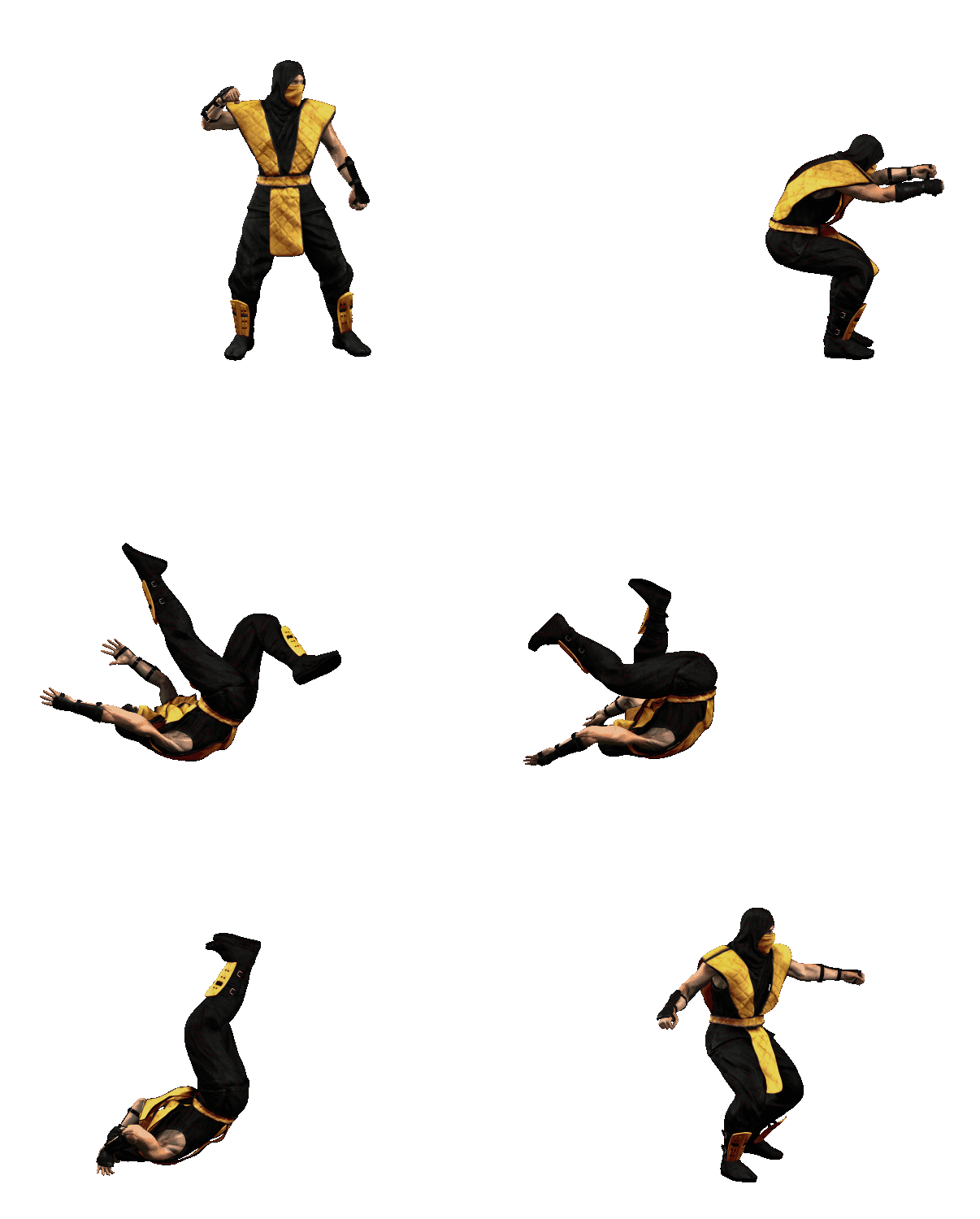
Mmmmm, not too happy with this one, but it's taking too long so, I'm leaving it for now.

MK1HD_Scorp_throw.gif


Code for this game will be locked, not for editing.

The sprites from me can be used, I don't mind sharing my stuff.

I'm coding my own version of the characters, so people can edit that if they like. I'm not going to copy MK's game play as close as this project is intending.

Sharing of anything depends on the person who made it.
 
Last edited:
The cloth animation really sucks, and I'm having a hard time getting it to look right. The arm thickness is collapsing too much. It looks bad, but I can't really fix that with the rig I have now. It's a typical problem with 3D models, if a bone is twisting too much, it gets too thin, like a candy wrapper.

Now you see what I mean, when I say that I need to feel that pressure from working with others... I get a big boost of energy from it.
 
Last edited:
I see, well... you're doing a great job, and besides cool and appreciated by all MK fans on earth, it would make a great add to your portfolio, eitherway you're not wasting your time, you're just creating a bunch of addicts to this page...!

Note: How long would it take you to finish the model of Cage and post the standing animation? (I cannot wait). :)
 
Bleed, I think the animation looks amazing. Don't need to be fixed.
So we have now all the moves else finish moves.

I think before move to other char will be better if you do the few animations of sub-zero. (Idle, Walk, freeze and Slide, maybe win pose in case the mirror sprite create a bad lighting and shadows)

BTW, are you going to update your site with the rest of Scorpion Animations? They looks really amazing all together.
 
Top