You are using an out of date browser. It may not display this or other websites correctly.
You should upgrade or use an alternative browser.
You should upgrade or use an alternative browser.
Mortal Kombat HD Remix with MUGEN
- Thread starter Spawn16
- Start date
uKER
New member
Well, here's what I did to the select screen:
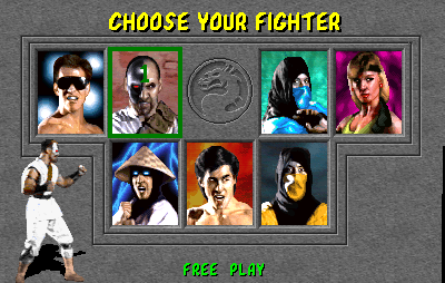
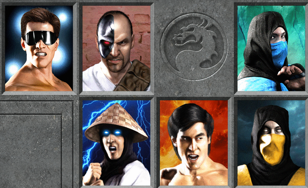
The ones who get the most out of it I think are Liu Kang and Kano.
I always thought Liu Kang was missing a certain something that made it look more asian, so I tried to go towards that and I also tried to go for a better approximation to the mouth expression. I also did some color grading changes to his hair, so that the black level looked more in line with the ninjas' hoods.
On Kano, the face seemed too robust, and the expression in the brow too aggressive. Also, the shoulder band was too wide.
Other stuff I did was reduce Johnny Cage's traps and did some minuscule tweaks to his mouth area, some minor tweaks to Raiden (mostly what I had already presented before and some color correction stuff). I straightened Sub-Zero's face a bit and slightly altered the lighting in his hood, and both SZ and Scorpion got some minuscule tweaks to their eyebrows.
Also, I lowered Kano and Sub-Zero's backgrounds' saturation a bit, which at some point I felt were a tad too high, but I'm not too sure about these. In particular Kano's has these blotches with more saturation that I probably should have kept. In Sub-Zero's case it was mostly because the background was much more saturated than his mask, so it was a bit too prominent, but I didn't want to increase the saturation of the mask.
If we decided to go forward with these changes, I don't know if [MENTION=14435]MrMos3s[/MENTION] will intend to incorporate them into his portraits, or this can go into a final touchup pass to the actual selection screen as a whole.
I'm fine either way.
Last edited:
RigoHoward
New member
Impressive result uker and mr mos3s... so we all want to see Sonya's portrait ")
Enviado con uno de aquellos.
Enviado con uno de aquellos.
MrMos3s
New member
Yes, I had mentioned it before, but I have plans to do final touch-ups when all the characters are finished. I probably won't go as far as you suggest, but there are a few things you point out that I had already planned to do. I guess I can let you know when I'm ready for more suggestions.
Last edited:
arq_hawkin
New member
Well, here's what I did to the select screen:
The ones who get the most out of it I think are Liu Kang and Kano.
I always thought Liu Kang was missing a certain something that made it look more asian, so I tried to go towards that and I also tried to go for a better approximation to the mouth expression. I also did some color grading changes to his hair, so that the black level looked more in line with the ninjas' hoods.
On Kano, the face seemed too robust, and the expression in the brow too aggressive. Also, the shoulder band was too wide.
Other stuff I did was reduce Johnny Cage's traps and did some minuscule tweaks to his mouth area, some minor tweaks to Raiden (mostly what I had already presented before and some color correction stuff). I straightened Sub-Zero's face a bit and slightly altered the lighting in his hood, and both SZ and Scorpion got some minuscule tweaks to their eyebrows.
Also, I lowered Kano and Sub-Zero's backgrounds' saturation a bit, which at some point I felt were a tad too high, but I'm not too sure about these. In particular Kano's has these blotches with more saturation that I probably should have kept. In Sub-Zero's case it was mostly because the background was much more saturated than his mask, so it was a bit too prominent, but I didn't want to increase the saturation of the mask.
If we decided to go forward with these changes, I don't know if [MENTION=14435]MrMos3s[/MENTION] will intend to incorporate them into his portraits, or this can go into a final touchup pass to the actual selection screen as a whole.
I'm fine either way.
nice touch-ups man, Love what you did with liu and kano, especially with liu's mouth
Last edited:
londonhellgate
BANALITY
Well, here's what I did to the select screen:
The ones who get the most out of it I think are Liu Kang and Kano.
I always thought Liu Kang was missing a certain something that made it look more asian, so I tried to go towards that and I also tried to go for a better approximation to the mouth expression. I also did some color grading changes to his hair, so that the black level looked more in line with the ninjas' hoods.
On Kano, the face seemed too robust, and the expression in the brow too aggressive. Also, the shoulder band was too wide.
Other stuff I did was reduce Johnny Cage's traps and did some minuscule tweaks to his mouth area, some minor tweaks to Raiden (mostly what I had already presented before and some color correction stuff). I straightened Sub-Zero's face a bit and slightly altered the lighting in his hood, and both SZ and Scorpion got some minuscule tweaks to their eyebrows.
Also, I lowered Kano and Sub-Zero's backgrounds' saturation a bit, which at some point I felt were a tad too high, but I'm not too sure about these. In particular Kano's has these blotches with more saturation that I probably should have kept. In Sub-Zero's case it was mostly because the background was much more saturated than his mask, so it was a bit too prominent, but I didn't want to increase the saturation of the mask.
If we decided to go forward with these changes, I don't know if [MENTION=14435]MrMos3s[/MENTION] will intend to incorporate them into his portraits, or this can go into a final touchup pass to the actual selection screen as a whole.
I'm fine either way.
If the order of the gif file is not cheating to me, I am agree with all portraits, except rayden cause if you add more shines it lose realism and deep, however is correct about the rayden ´s noise at this position, flawless sugestions.
about sonya ´s statue, is 101% correct!
smoke.tetsu
New member
All the changes to the character select screen look good to me including the lighting changes to Raiden. If you look closely at the original version you'd see the lighting on the edited version matches it more.
On the other hand I'm not sure the change to Kano's laser eye to make it match the original more actually works well for the character... it kind of changes his expression a bit and makes him look less menacing. I sort of liked the scowl a bit better personally speaking. I don't know.. I have mixed feeling about it as the edited version does look more 1:1 to the original in composition.
Also, I didn't say it in so many words but the changes to the teeth on Sonya's statue are actually exactly what I had in mind when I was giving my critique earlier. The skin still looks pock marked which makes her face look scarred to me but the teeth are a great change regardless! It really helps to make it look more like a statue version of her rather than taking the actual person and painting over them like cosplay or something.
Yeah I realize she'll end up being downscaled to fit into the stage and thusly smaller and we wont see her as clearly but still those are some positive changes in my opinion because of what I said above. Attention to detail is one of the great things about this project.
Last edited:
uKER
New member
Thanks for the feedback. That's the kind of commentary I enjoy reading.
The metallic side of Kano's face I reckon should look like Terminator.
A severe, imposing but neutral expression.
Making him look more menacing may seem more flashy and more attractive to some, but I would personally like to avoid artistic liberties as much as possible.
Especially in MK1, a game characterized by its low brow, no fuss tone.
Sent from my Nexus 4 using Tapatalk
I agree. Match what we see, take liberties only with what we can't.
Thanks for the feedback. That's the kind of commentary I enjoy reading.
The metallic side of Kano's face I reckon should look like Terminator.
A severe, imposing but neutral expression.
Making him look more menacing may seem more flashy and more attractive to some, but I would personally like to avoid artistic liberties as much as possible.
Especially in MK1, a game characterized by its low brow, no fuss tone.
Sent from my Nexus 4 using Tapatalk
Here's this.
Personally, I'm happy with the way it turned out.
Hope you like it.

I'll get this statue into the background since I think you nailed it.
RigoHoward
New member
Nice work on sonya statue too... it's me or the hair looks like spaghettis?
Enviado con uno de aquellos.
Enviado con uno de aquellos.
uKER
New member
Glad the statue has had a good reception.
In case anyone is interested, here's the original and modified versions for side-by-side comparison.
I'll try to get the background for Sonya's portrait done today.
EDIT: RigoHoward, maybe you're right. If the hair still looks weird when downscaled I'll see to do something with it.
In case anyone is interested, here's the original and modified versions for side-by-side comparison.
I'll try to get the background for Sonya's portrait done today.
EDIT: RigoHoward, maybe you're right. If the hair still looks weird when downscaled I'll see to do something with it.
arq_hawkin
New member
Glad the statue has had a good reception.
In case anyone is interested, here's the original and modified versions for side-by-side comparison.
I'll try to get the background for Sonya's portrait done today.
EDIT: RigoHoward, maybe you're right. If the hair still looks weird when downscaled I'll see to do something with it.
to me the hair looks spoted on, cause since it is an statue that's the way the hair should be done

If I didn't know it was a smile, I'd say that Sonya is doing the duck face
Great job on select screen and statue uKER, I love when you add that kind of details.
LOL once you said that I couldn't unsee it. Hilarious! The spaghetti hair and smile will be barely visible when in the arena. I'll try and post something tonight.
Cris Berserk
Member
Calactyte and Uker, great job you did together. regarding the statue of Sonya congratulations.