Mortal Kombat HD Remix with MUGEN

View attachment 5609

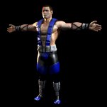
hello again, I just wanted to show you my first render of sub zero, I'm doing this for fun :)
That's great. You got the face really well.

What I can say is that you should make the top of his head wider and flatter on the top.
Also, his forehead is supposed to be vertical. It shouldn't slope to the back.

This should help you with John Turk's head shape.

John_Turk_as_Thug_Zero_in_Henchmen.jpg


Could you try getting the camera further away and reducing the view angle to compensate?
This fisheye view doesn't help in assessing body proportions.
 
Last edited:
The material settings are so realistic looking and the lighting/skin tone so perfect it nearly looks like a photograph.

I'm not entirely sure about the proportions though. He looks a bit squat like his legs are too short. What really blows me away though is the torso material and the model details you put in there.

View attachment 5609

hello again, I just wanted to show you my first render of sub zero, I'm doing this for fun :)

 
KANG_TEST.png


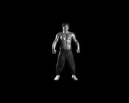
First pass at Kang. I think I'll need to photoshop the proportions to match the original. His crotch area is hanging too low, and his fists might bit a bit too big.
 
Sorry to say this, but while I like the statue conversion, I'm not liking the model. :/
I'll help in whatever I can to make it better, but since this is the model that will be in the game, I don't think fixing the statue in Photoshop is the best thing to do.

The shoulders are MASSIVE, and so are the forearms and fists.
The whole abdomen is way too muscular and too wide. Notice there's also a place above his waist that is thinner than the waist itself. His ribcage is also nowhere to be seen.
His sternum seems sunken. His clavicles should be horizontal. Them being sloped inwards makes it seem like he is sinking his chest.
His chest should transition seamlessly into the shoulders.
The face is too small.
The pants' legs' width goes down pretty much unchanged until well below the knee, where they abruptly get thin.
In the original, the pants get progressively thin right from the top, without changing suddenly at any particular point.
Also the pants are too low.

I'll make a mockup of what I think needs changing and upload it in an hour or so.
 
Last edited:
I don't recall the statue was so weird, I'm sure you got the displacement map sooo strong, I will render the statue with my settings so you know what I mean.

Maybe exporting it to obj messed it up

EDIT:

here cal, look, this is the same model and it doesn't look that weird, check you displacement and normal maps please.

sta.jpg
 
Last edited:
hey arq you use vray right? I should give you my file which has the light scheme but you can do the displacement and then render. That should eliminate any errors.
 
Well, I assume this is probably based on a model that wasn't rendered as it was supposed to, but for what it's worth, here's what I'd expect this to end up looking like.

KANG_TEST_zpsb2e2b310.gif
 
Last edited:
Nice work on Sub arq

I found some helpful videos on youtube for faster Vray render settings. My renders are much faster now thanks to these.

http://www.youtube.com/user/paulfatkins3987/videos


thanks a lot, I'm trying to get as good as you are, that last baraka you posted was..... let me say it like this... MY OH MY :).

did you try the script??? I really think you should try it..... it is the fastest way to optimize vray, believe me
 
uKER is impressibly good at giving suggestions and I think that's more important than what most of us can usually say, nevertheless I was so astounished at that MK3 Sub-Zero that I gotta get it out of my chest: THAT LOOKS ALMOST LIKE A HUMAN BEING...!!!
 
Top