Mortal Kombat HD Remix with MUGEN

A couple of other things I noticed. The first most obvious thing are I think you where making the red eye a bit too bright. Certain newer representations of Kano including the canned MK HD Kollection version had a very bright almost lens flare inducing eye. However in the original it was more like not really glowing at all... just red\glassy. Perhaps a middle-ground solution would be the best. Either way it's probably better to tone down the glowing if not eliminate it completely.

Also it may just be me but the ammo pouches seem a bit too loosely bound with the flap that closes it and the straps & not boxey enough.
 
Last edited:
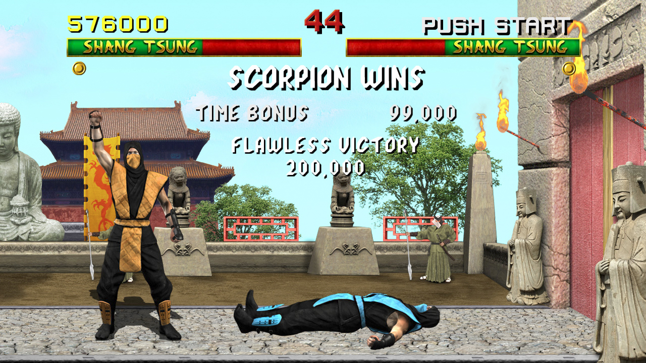
I decided to give the lifebars a shot since 2d graphics/interface design is my thing. After experimenting I felt like it was best to keep it simple, I know its not a big change but here it is anyway:

lifebars1.jpg


lifebars2.jpg
 
That Liu Kang pic is his TYM sprite, with added pants and painted shoes (probably resized from his winning pose sprite)
Anywayz, here's some of their TYM sprites to see Liu's hair and Kano's facial hair better:

liu1m.png

kano1.png

kano2.png
 
I decided to give the lifebars a shot since 2d graphics/interface design is my thing. After experimenting I felt like it was best to keep it simple, I know its not a big change but here it is anyway:

lifebars1.jpg


lifebars2.jpg

I really do like this, there is something about that almost straight yellow that pops out and may possibly pop out better over the very detailed stuff going on in the stages. I like that it's a minimal alteration from the original and very familiar to MK1.

But I do still really like Justin's alterations which are still somewhat minimal but add a bit of detail and flare, he also seems to have made them in a way that will still pop out. So I can't really decide. I think I'm still leaning towards Justin's version more, but I'm leaving it up to everyone else.

One thing I will say, I've always imagined the green (life) should look as though it's on top of/covering the red (blood) and your red seems to have a slight bevel where the red and green meet, giving the impression that the red is on top. I could be wrong here, just my thoughts.
 
Yep, the one Justin made looks nice.

Its important to see how it looks within the game, I feel like something a bit more simplistic was a better fit. Still a difficult decision though.

Here is Justin's lifebars within the game:
lifebars3.jpg


Btw, you're right, the red is on top of the green, that can be reversed.
 
New Lifebar update with fixed kerning. I numbered them so people can easily shout out which they like best. I'll make an in-game mockup so we can see it that way too.

View attachment 4786

External Link: http://www.mediafire.com/view/?jipkt071dc9003a


EDIT: Here is a mockup screenshot with the same corresponding numbers as the image above.


View attachment 4787


External Link: http://www.mediafire.com/view/?htjr9k59zgng7c8


Number 1 looks great, and it would probably have to stay at least that bright depending on what it looks like over the brighter stages.
 
OMG JMANIMAL... THAT'S TOTALLY AWESOME...!!! *o* 100% MK1...!!!

The red stuff should be inverted tho, as MrMos3s pointed out, but personally I felt so much the MK1 spirit, in my mind the whole picture became complete.

I do like a lot what Justin did with the letters, making them ocupe about the same space of the original ones.

Edit: I think Justin's life bar version could be used for MK2 with a few tweakes, so all his work and details wouldn't be lost at all.

Inside_PSN_MKII.jpg
 
Last edited:
Sooo, in the Test Your Might sprites, looks like Kano doesn't have a beard at all to me. I'mma just leave it as is MrMos3s.

Meh, looks like a pinch of a 5 o'clock shadow :p Basically, he doesn't look quite as clean shaven as he did in MK3, but maybe it's just my eyes playing tricks on me.
 
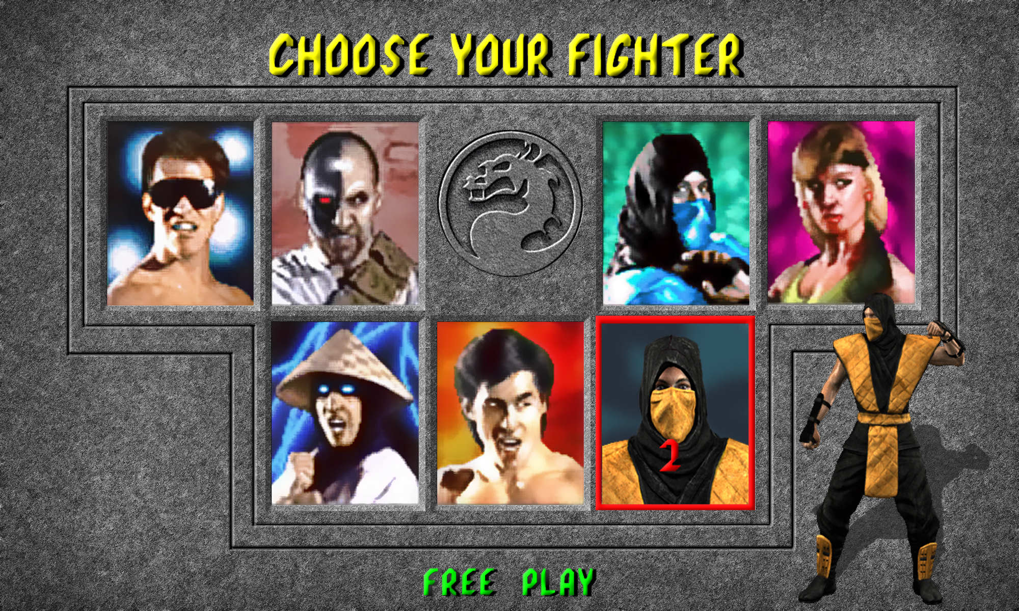
I could be wrong, but for his select screen photo, I think Kano's eyes are supposed to be looking to his left. Basically like Sonya and Liu Kang.

EDIT: Like this...

KanoLook.jpg
 
Last edited:
I could be wrong, but for his select screen photo, I think Kano's eyes are supposed to be looking to his left. Basically like Sonya and Liu Kang.

EDIT: Like this...

View attachment 4794

I dont see it. I see kano looking to his front. Look:

9.jpg


Don't get upset, but this way there seems like it is a eyed. He's a one-eyed and now a squinting? hehehehe ^.~
 
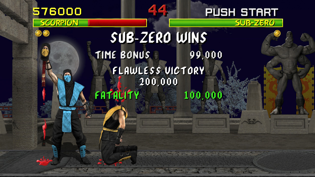
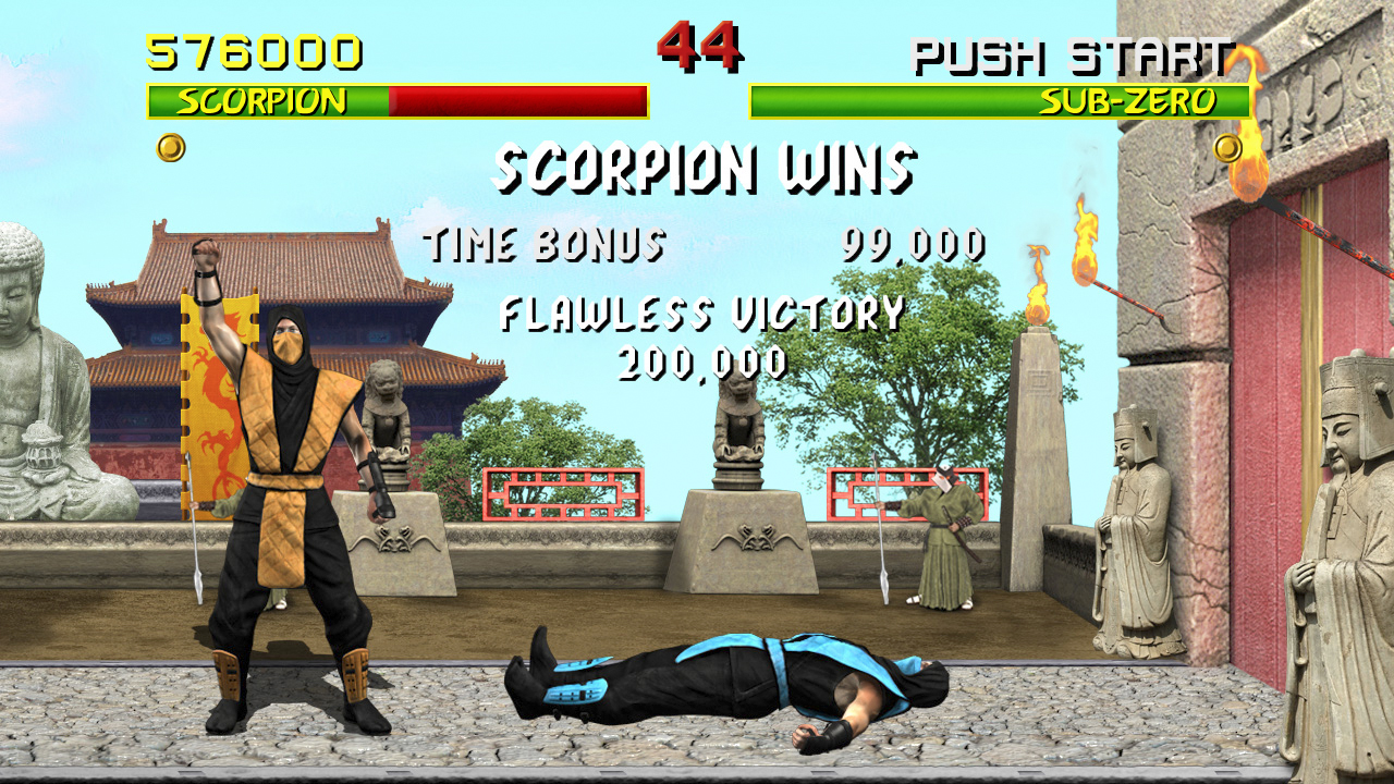
Just for an experiment, I decided to mess with the after match on screen text. Just the flat text with a duplicate black drop shadow looks a little lo-fi to me, especially when paired with Bleed's work and the stages. So yeah, I made this little mockup with an alternate version of the "TIME BONUS" and "STRENGTH" pop up text. See what you guys think.

UI Experiments.jpg

External Link: http://www.mediafire.com/view/?1uct2emlzg8pf3y
 
Not bad, but I think there s a "rude" contrast between Time Bonus and Strenght in comparison with "Fatality" or even "Danger".
 
Top