You are using an out of date browser. It may not display this or other websites correctly.
You should upgrade or use an alternative browser.
You should upgrade or use an alternative browser.
Mortal Kombat HD Remix with MUGEN
- Thread starter Spawn16
- Start date
smoke.tetsu
New member
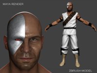
That's looking good even without the full chrome effect on closeup.. on the far shot it looks pretty chrome'ey as it is. I'm sure MrMos3s can help with the closeup if necessary. Looking at it full size I kind of think the diffuse looks a tad low res though. Also I see you have worked on the crotch a bit but I think it still doesn't look as low\baggy as in the original sprite.
Mortal Gojira
New member
Yeah, his texture is pretty blurry. I'll paint up something more high def soon enough. I just wanted to get a good render out to test some things like how the mesh flowed and maps. Now that I have the settings good enough, I can go back and make the correct updates.
AntrAcsA
Member
http://www.youtube.com/watch?v=hx292crZnsI
You'll notice difference in previous video. Here was 2 layers with different movement.
Hey
arq_hawkin
New member
Alright, made it look a lot thinner. No bevel this time. I will have to work on the shaping though, so give me a little bit on that. This is taking a whole longer than I thought, so bear with me:
View attachment 4763
mortal gojira, your kano is looking great man, congrats, but the pants should be lower and more baggy I guess.... I can see, you're good working with maya, I want rig my liu kang in maya cause I've seen videos on youtube and I just can't believe all the things maya does. for animation I can see Maya is better than max, because of the hair, muscles, cloth an all those things, do you know anything about what I just mentioned?? that way if I change to Maya I can ask you if I get stock
I have Maya 2013
DjangoJustin
New member
Hey guys, I'll make an update to the healthbar at post it up asap.
MrMos3s
New member
Alright, made it look a lot thinner. No bevel this time. I will have to work on the shaping though, so give me a little bit on that. This is taking a whole longer than I thought, so bear with me:
View attachment 4763
Looking great so far! The bevel looks a lot better, the reason I brought it up in the first place is because I'm not 100% sure what the original intent was, does Kano have the plate implanted into his skin? or is it more like a mask laying over top? it looks both ways with all of the references I've seen but seems they have made it look implanted for most of the in-game art. Maybe La_Luna could hook us up with a few references on this.
You did good with the plate texture, it definitely looks more metallic now, but I think chrome almost has more of a mirrored effect, if that makes any sense. I'm posting my quick mock-up that I messed with the other day as a reference. I could always help with this in the final portrait if need be, too.
View attachment 4717
And yeah, I'm sorry for all of the back and forth, I know it can get tedious at times, but I (and I'm sure everyone here) appreciate your patients and amazing skill and hope you don't overwork/rush yourself to the point where this is no longer fun for you. Take your time and feel free to tell me to shut up if I get out of hand.
DjangoJustin
New member
Oh, and MrMos feel free to to tackle the blood effects if ya like. I think that's much better in your hands.
MrMos3s
New member
Oh, and MrMos feel free to to tackle the blood effects if ya like. I think that's much better in your hands.
Sounds good sir, I'm wondering though where to start with this, are there references or files of some sort in the DB?
theotherguy
New member
While I have nothing against smoke.tetsu's lifebar edits, something about them gives me an MK2 vibe.
I'd be happy with either, but Justin's seems more in line with the original style while still giving it a nice HD makeover. Should look really nice with correct font.
Really nice to see so much going on. Also with more people involved in making the character models, it seems like everyone is feeding off each others accomplishments. Great work.
Mortal Gojira
New member
mortal gojira, your kano is looking great man, congrats, but the pants should be lower and more baggy I guess.... I can see, you're good working with maya, I want rig my liu kang in maya cause I've seen videos on youtube and I just can't believe all the things maya does. for animation I can see Maya is better than max, because of the hair, muscles, cloth an all those things, do you know anything about what I just mentioned?? that way if I change to Maya I can ask you if I get stock
I have Maya 2013
Thank for that. Very much appreciate it.The changes for the pants will happen soon enough, I just haven't got around to it yet. As for the rigging and animating, I know very little about that, so I will be of very little use to you in that area. I recommend though that you keep searching youtube. Its pretty good for tutorials. 3Dtotal should have some good ones as well. Or if you can, get a subscription to The Gnomon Workshop of Digital Tutors. Very helpful sites
Mortal Gojira
New member
Looking great so far! The bevel looks a lot better, the reason I brought it up in the first place is because I'm not 100% sure what the original intent was, does Kano have the plate implanted into his skin? or is it more like a mask laying over top? it looks both ways with all of the references I've seen but seems they have made it look implanted for most of the in-game art. Maybe La_Luna could hook us up with a few references on this.
You did good with the plate texture, it definitely looks more metallic now, but I think chrome almost has more of a mirrored effect, if that makes any sense. I'm posting my quick mock-up that I messed with the other day as a reference. I could always help with this in the final portrait if need be, too.
View attachment 4717
And yeah, I'm sorry for all of the back and forth, I know it can get tedious at times, but I (and I'm sure everyone here) appreciate your patients and amazing skill and hope you don't overwork/rush yourself to the point where this is no longer fun for you. Take your time and feel free to tell me to shut up if I get out of hand.
You know, I was thinking about that. I know in later games it looks like its his skull exposed, but for part one it just looks like its resting on his skin. I was wondering if I should add some raise to the skin around the mask like you did to make it look like he was cut open, or leave it as is.
And Maya does have a good chrome material, but it just washes away all the shading. I'll play around with it to try and get better results.
And I appreciate that, thanks. And you guys have been crazy helpful to me. The feedback and suggestions have been nothing short of great. Made me look at the work in a different perspective and also helped with me fixing it. And I hope I didn't sound like I was complaining about anything. The workload is fine, and the back and forth criticisms are very much welcomed. How I prefer it, really. All this is very good practice for me for the near future.
In the Mortal Kombat movie, which Tobias and Boon worked, Kano has it embedded in his skin. It can be raised around the edge and redish colored skin tone. It shouldn't look like an open wound or anything since that would imply he had that surgery done recently.
You know, I was thinking about that. I know in later games it looks like its his skull exposed, but for part one it just looks like its resting on his skin. I was wondering if I should add some raise to the skin around the mask like you did to make it look like he was cut open, or leave it as is.
And Maya does have a good chrome material, but it just washes away all the shading. I'll play around with it to try and get better results.
And I appreciate that, thanks. And you guys have been crazy helpful to me. The feedback and suggestions have been nothing short of great. Made me look at the work in a different perspective and also helped with me fixing it. And I hope I didn't sound like I was complaining about anything. The workload is fine, and the back and forth criticisms are very much welcomed. How I prefer it, really. All this is very good practice for me for the near future.
Alright, made it look a lot thinner. No bevel this time. I will have to work on the shaping though, so give me a little bit on that. This is taking a whole longer than I thought, so bear with me:
View attachment 4763
You know what would be really cool? If you made it mirror shiny like in the game but with thumb prints, and scratches.
vetalfox
New member
I always thought Kano was made after this guy:Looking great so far! The bevel looks a lot better, the reason I brought it up in the first place is because I'm not 100% sure what the original intent was, does Kano have the plate implanted into his skin? or is it more like a mask laying over top?
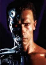
Red eye, metal skull, heart rip fatality. Considering the year MK1 was made, Terminator was one of the most famous action movie heroes, so why not use him. After all most of MK1 cast was made after some action movie heroes. He even have a woman he want to kill.
And if you consider his renders after MKT as any indication - this plate clearly looks more like a metal skull than mask since MKDA days
Last edited:
You'd need to create a mix map material in Maya which combines the shiny property with scratches and dirt.
You know, I was thinking about that. I know in later games it looks like its his skull exposed, but for part one it just looks like its resting on his skin. I was wondering if I should add some raise to the skin around the mask like you did to make it look like he was cut open, or leave it as is.
And Maya does have a good chrome material, but it just washes away all the shading. I'll play around with it to try and get better results.
And I appreciate that, thanks. And you guys have been crazy helpful to me. The feedback and suggestions have been nothing short of great. Made me look at the work in a different perspective and also helped with me fixing it. And I hope I didn't sound like I was complaining about anything. The workload is fine, and the back and forth criticisms are very much welcomed. How I prefer it, really. All this is very good practice for me for the near future.
DjangoJustin
New member
Quick update to the healthbar with a few variations. I used the new font, but I didn't realize how much space the original text took up on the bar. I could fix that easily, but I'm not sure that's needed here as it looks kinda crowded that way to me. It seems to me like that was done to keep the names legible in such low resolution, but that's really not a problem anymore. Anyway I'll let you guys make that call.
Also on the last variation I used another font, just cuz I thought it looked cool. ;P

Also on the last variation I used another font, just cuz I thought it looked cool. ;P

DjangoJustin
New member
That's definitely doable. Thanks for the crit.

