Mortal Kombat HD Remix with MUGEN

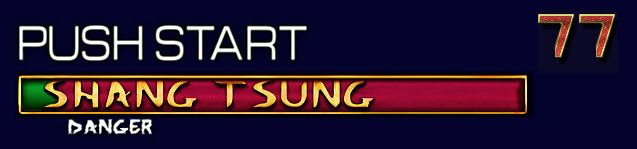
Smoke: I respect your technique involved in making the life bars, they don't look bad and it's apparent that you've put some time and effort into them, but so far I like the original life bars a bit better for this project, probably simply because they have the familiarity of the originals that I remember so well, although I'm not saying something very minimal couldn't be done to make those better as well.

I understand this is going to be in HD so we have more pixels to work with, but 'in my opinion' the overall textures are a bit too noisy/contrasty/distracting, there is probably a better way for me to explain what I mean but I can't think of one right now. Sometimes less=more. This, of course, is just my opinion, and hopefully you take constructive criticism well.
 
Last edited:
Well, if speaking objective, Smoke's lifebars look more interesting. While calactyte's version more close to MK1.
I think best solution here - take best from both versions:
Smoke's - names text, green layer (just need to make it darker);
Calactyte's - red layer, timer text.

my opinion should hold some weight
May be, but repeating about 14 years wasn't very politely.
 
Last edited:
@MrMos3s: Thanks for your candidness and respect although I have to disagree on the noise. I mean... yes, the original was simpler for simpler days and low resolution monitors.. but it did have grain to the empty part which even in Cal's is just simulated by noise.

Here's the original upscaled:

Screen Shot 2013-01-31 at 12.21.24 AM.png
 
Yeah, like I mentioned above, I know that wasn't the best way to explain it, but the actual noise/grain filter is not what I meant exactly, I meant noise more as in a distraction or too much going on in a small area. Your grain/noise filter is one of the things I do like about your version. I could attempt to explain further later but I've been at work all day, bed time for me. ;)

Also guys, I should have some time for a task or two this weekend, should I start with the warrior shrine fighters? Or will Gojira have a portrait for me? (WINK WINK NUDGE NUDGE) I'd love to jump back into this with a portrait, but no rush :D

Stay good.
 
Okay, so now I'm confused after going back a few pages, are you and UNREALWINS working on this together or something? I'll check for your response tomorrow, I really need to go to bed.
 
Well I did attempt to simplify the shading somewhat although done too much to the point where it's flat shaded once again would be like well.... what's the point? But I do have a version up there that tries to accomodate everyone I even made the green a bit darker... although the original wasn't very dark to begin with and had a lot of contrast too.

No, we are unrelated whatsoever.. I just decided to make some mockups removing the extra "noise" as you put it from the original which was even MORE noisier with the portrait and such than mine. I saw his original mockup and got enthused about it and felt if I made a mockup taking the best elements from it then people would see the value\how good it would be minus stuff like the head. I guess that sorta backfired on me.

UnrealWins may end up not liking it either since I changed quite a bit as per criticism. Mostly Cal's.
 
Well yours has more depth to it due to the drop shadow although the font change is not really MK any more but that as a good attempt anyway. I think the green is probably a bit better too.
 
I edited your green part into mine for fun (and profit? some other changes too):

lifebar4-1-1-3-3.jpg


And with that I think I spent\wasted enough time on this... :)

*couple of hours later... ends up compulsively tweaking it anyway* :p
 
Last edited:
Yeah I realized when I pasted it into a pic with the originals & current version I desaturated it a bit too much. I back peddled on that... still I do kind of agree on the colors on Justin's. But I made some adjustments on mine anyway.
 
I edited your green part into mine for fun (and profit? some other changes too):

lifebar4-1-1-3-3.jpg


And with that I think I spent\wasted enough time on this... :)

*couple of hours later... ends up compulsively tweaking it anyway* :p

I think we would get a much better idea if you implemented these lifebars on some screenshots of the game
 
Very good attempt, Justin! Like already said, only need to change font.

do you really have to just make it look like the arcade
Well, I think it's temporary and will be changed.
 
Last edited:
I must say I don't like Cal's life bar too much, it looks too old in comparison with the stages and characters. I think the life bar should look fresher, while still true to the original, just like music, stage and characters.

smoke.tetsu: I agree you should implement your life bar in a fake screenshot for us all to see, I also (sort of) congratulate your effort at being civil, I know it's not easy to get your ideas/contributions rejected, nevertheless I invite you to double check reality. This is not your project and we all are fortunate that this is happening.
 
I agree you should implement your life bar in a fake screenshot for us all to see
Too much effort for too little return. But here's one last ditch effort.. with "less contrast" and a tad less shine as well (almost to the point of severely compromising the design)... so behold what will never be... BTW even with more contrast I highly disagree with Cal that it looks "hand drawn". If anything I think it looks more like CG... I did do most of the fine tuning by hand though.. *shrugs*

lasteffort.jpg

Just to note the colors probably wouldn't have been final and doing it in separate files instead of all in one would help. Yeah I realize the position on the second player is incorrect..

If Justin wants to do a mockup it's his responsibility.
 
Last edited:
Top