Mortal Kombat HD Remix with MUGEN

MK_5.jpg

New bar and new letter colors to put the game more"serious" (and keep safe some eyes with high brightness of yellow) ^^

Edit (in game bar):

Animated:
9324730orig.gif


Static:
MK_6.jpg
 
Last edited:
MK_5.jpg

New bar and new letter colors to put the game more"serious" (and keep safe some eyes with high brightness of yellow) ^^

Edit (in game bar):

Animated:
9324730orig.gif


Static:
MK_6.jpg


I know I haven't really contributed anything, but I honestly think that the color changes to the text is deviating a step too far from the original. Otherwise, great work.
 
Great progress here guys... love watching all of the models come together and can't wait to see them all animated and in battle. I've seen MKHD from day 1 and never have left, awesome job. Blows my mind with how good things look.
 
Kano model from cancelled MKHD Kollection. Looks like he's just wearing some light tan combat boots with his baggy pants tucked into the tops of them. Basically like Guile from Street Fighter.


External Link: http://www.mediafire.com/view/?fbtwpkh3qmev1rg


@UNREALWINS, I liked the text effects in the first example you posted on the other page. The lifebar however looks far too simple and graphic-arty for MK in my opinion.

With my UI stuff, I was trying to go for realism, since that was a (the?) defining staple of the original MKs. It looks like you are going for something else. I guess I can't really say which of us is right.
 
Last edited:
Yeah, looks weird. Don't think its what Divizio wore, but I'll do a mash of the two I guess. Thanks

Your Kano is looking really awesome, man. That head is really great. Whenever you start polishing the the clothes, I agree with the other guy that said his pants could be a little baggier. Something closer to that model above I guess. Keep up the great work man!

EDIT:

Crappy pic from MK1 photoshoot:

 
@Justin Slaughter Thank ya. And yeah, I tried to make his pretty baggy and wrinkly. I'll update with a pic soon

@gtrplyr515 thank u, sir. We're trying
 
The pretty much look like bedroom slippers at this point, but hopefully I can sculpt them into something more interesting

update on pants and shoes:

33.jpg
 
I hate to sound like a broken record, but the work you all are doing is amazing! The updates I'm seeing can sometimes be the high point of my days :-D
 
Okay, remade the lifebar pretty much completely and I'm liking it a lot better. In the direct comparison, number 1 is the more yellow version of the new bar. I used that version in the following two mockups. Also, I darkened the red a bit just to help relate that it's behind the green area.


I definitely like #2 and I'm thinking maybe we should go final with this one and move on.


Click the image for full size and quality.
lifebarexamp2.jpg


I did 3 things with the life bar in the image above that I'm sure you could easily fix on your psd.


Click the image for full size and quality.
lifebarexamp1.jpg
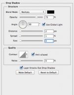
Swapped the shadow from the green side to the red side making the green look as though it's overlapping the red, this is still up for debate and I haven't really gotten many opinions on it yet but it seems to match the original intent somewhat. Filled in a vertical and horizontal row of pixels and added a sharp drop shadow under the border that seems to be good for this resolution. (drop shadow settings that I used are below)

Are we able to use transparent PNG's for the life bars shadows in mugen? It would really help, anybody know?


my drop shadow settings:
dropshadow.jpg
 
Last edited:
Hey thanks Mos! I can definitely fix that stuff up! I completely agree about the shadow placement issue. And I think I fixed the transparent pixels in a later version than I posted. Good eye!

EDIT: Fixed the above mentioned things.


External Link: http://www.mediafire.com/view/?7qufz7yaq1ghvbh


I like your drop shadow idea, but I'm not sure MUGEN supports .PNGs. :(


Looks good! Yeah I'm not positive either, I'm pretty sure the blood sprites work as transparent png's but not sure about the shadows, but I think it really works without them too.

If we find out the transparent png's don't work and we think it needs it, a single line of kind of medium-dark orangish/brownish pixels under the border would probably work fine. Hopefully someone that knows will see this. :p
 
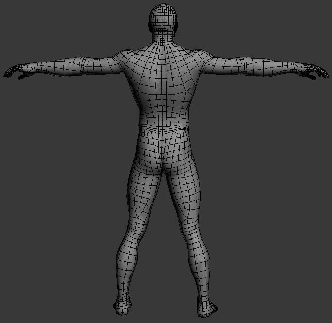
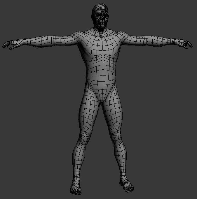
Body topology is ready, going for a simple and effective edge flow.

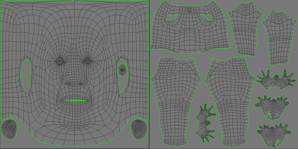
Looks like the only way to avoid the seam on the neck when having two UV maps like this, is to move one section out of the 0 to 1 space when exporting. Later move the body back in to the 0 to 1 space, and move the head out of it.

If you keep all the parts in the same file, it comes out with a less noticeable seam. Can't get rid of it 100%.

To avoid the seam 100%, you need to have all the UV shells in the 0-1 space. Not separated like I have here, but that means less detail for the head and body.

Cage_UVs_zpsb671eabe.jpg


Cage_frontwire_zps837f4ec9.jpg


Cage_backwire_zps31460a6d.jpg
 
Last edited:
@Gojira: Here you have a better look at Kano's feet is not the original attire used during the creation of the game, this one was a reworked version for a video game expo, but I think it will be useful.

autogkano.jpg
 
Top