jarvis653
New member
Excellent work! Send it over when you can.
Thanks! Have sent it now.
Excellent work! Send it over when you can.
Luckily we can use some of these animations for the other characters making some changesDoing the animation is holding me from making the other character models at this time.


thanks for the crits, jarvis653.
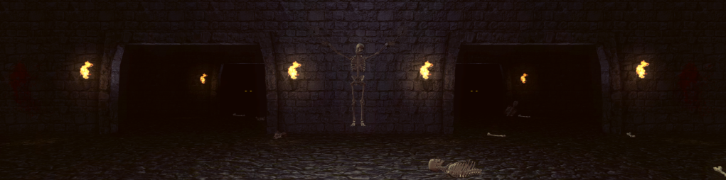
The stage was inspired in MK1/MK4 (classic looks)
I made the stage inside a 3D Game Engine (Unity3D) so the light come from light physics simulation me made it more realistic.
The floor is a texture in a mesh so maybe the texture need a higher resolution.
The illumination in the Arcade version is very confused, the floor looks green and the far gates with the yellow eyes in black, in the original stage the colors don't match well.
if we see this on MK4, that is pretty much like MK1 but with a realistic illumination. In MK9 all change so im not counting MK9 style.
I think if we try to make the stage 100% like the arcade version, it will looks pretty bad, colors not match well and all is unrealistic.
We have i high quality character now with a lot of details, we have to try to match all with the same level.
I think that my stage is a darker that the arcade version but it make it more interesting.
I think see if i can do some changes now, i have the stage in Photoshop so i have to remake all again.
So I thought I'd give some crit on the recent stage work being done. Firstly badmouse's goro's lair:
I did download the high res one, but it's disappeared now from this thread so this one will have to do for the post.
Anyway so you've done a great job badmouse, however there are things I feel need to be changed about it. The most important one is tone and lighting. This Goro's Lair reminds me more of the MK9 remake, which I consider a modernization. The original Lair is quite different:
The light source is not flames, but is actually coming from the top of the screen, which I assume is moonlight. This creates a very different feel compared to your version. The changes I'd like to see made:
1. Remove flames, change lighting and color to match original
2. The wall texture is perfect as it is, but the original has an additional texture that could be moss, so it might be a good idea to add that in
3. The ground texture should be changed, compared to the wall it is noticeably lower quality. Looks like it's been vertically squashed to create the angle, instead of natively created at that angle.
4. The skeletons/bones, in particular the one chained to the wall, should be edited to fit in more with the background, at the moment it stands out too much.
Also keep in mind the stage only reaches this height of the wall:
That's about all I have to say on it, again you have definitely done a great job on it, but it would benefit a lot from these changes IMO.
Something else I'd like to say on general stage creation, is that I feel it's important not to assume that every element of the original designs was simply a product of limitations. Artistic interpretation can be great but it needs to be restrained IMO, I think respect for those original designs is more important. I'll say a bit on the Palace Gates next.
Hey, i think you're too strict. Just TOOO much. Badmouse'd Goro's Lair looks VERY impressive, much better than the original. The thing is, that in original there was an ABSOLUTELY flat lighting, some objects looked primitive. For 1992 it was good enough, but if we want to make the game look REALLY cool, we must pay attention to this. It would look just ridiculous if we create full HD objects with good textures, but with the original flat lighting (no lighting effect at all). In badmouse's Goro's Lair, there's well seen where the light goes from - these fires. In original we just see the lair good lighted, as there's no front wall (where the observer/player stands) at all.
Badmouse just wants it all to look more realistic, and he makes incredible results. And his Goro's Lair looks much more MK1 than MK9. So, I raise my both hands for leaving Goro's Lair in badmouse's edition.
I just thought of something else...
Consider how the current lighting would affect the characters too. We already ran into problems with functionality with the Pit, thus why the bridge had to be remade to keep consistent lighting since the moon is in fixed position. The current lighting of the Lair is very dark, and since this is not a 3D engine, the characters to remain realistic would probably need another sprite set - already two are needed, one for day stages and one for moonlit stages. This could need yet another, and with so much lighting variation in the stage I'm not sure if it'd turn out convincing anyway. Therefore, if the stage was moonlit instead, we could use the moonlit sprites that would also be used in the Pit and the Warrior Shrine. Just some food for thought.
You're absolutely right about this. Would be nice if Badmouse tries to add some white-blue smooth light spots from the above, like the Lair has holes on the cieling and moonlight passes through.