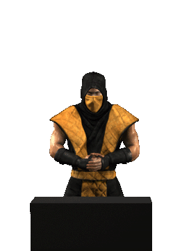
The forearm should be bow a little outward, looks wrong on the raised arm. Easy fir with the liqify tool. If you are removing, yellow parts, set the air brush style to colorize and pick the blue color and dab it out.
The fist can be fixed buy cutting the fingers out, squashing the lower part of the hand and moving the fingers down.
Blend it back in and you're set.
The hand was not modeled correctly, that's why this happens. I made the palm too long or didn't put the bones for the fingers far enough in to the palm. This is an old file, It looks better in the new ones, but still not perfect.
To fix the shine, take a soft brush at a low opacity and pick a color that is light but not too white.
Sketch over the shiny parts, but don't cover it completely. Maybe the brush can be very small, and just make little scratches over the highlight, to break it up.
In 3Ds.max you can play with the SSS skin shader, and lower the specularity setting.
I made the character shine like this, because the sprites were looking too flat without it at first.

")


")