Kasei Ouji
New member
This has a really simple background but I was just going to use it to pratice color balance layers ann when I got done i thought it was pretty cool so I added the text and well..... 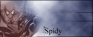
Special Forces said:It's cool but boring because your sigs are all the same. A sprite, a weird background and some crappy fonts.
Khaos said:Clouds + Poorly Cut Render + Poo font color + Bad Tech brush+ bad color
4/10
<3
Kasei Ouji said:Khaos said:Clouds + Poorly Cut Render + Poo font color + Bad Tech brush+ bad color
4/10
<3
The render is cut perfectly no edges or gaps, and I didn't use any brushes