Mortal Kombat HD Remix with MUGEN

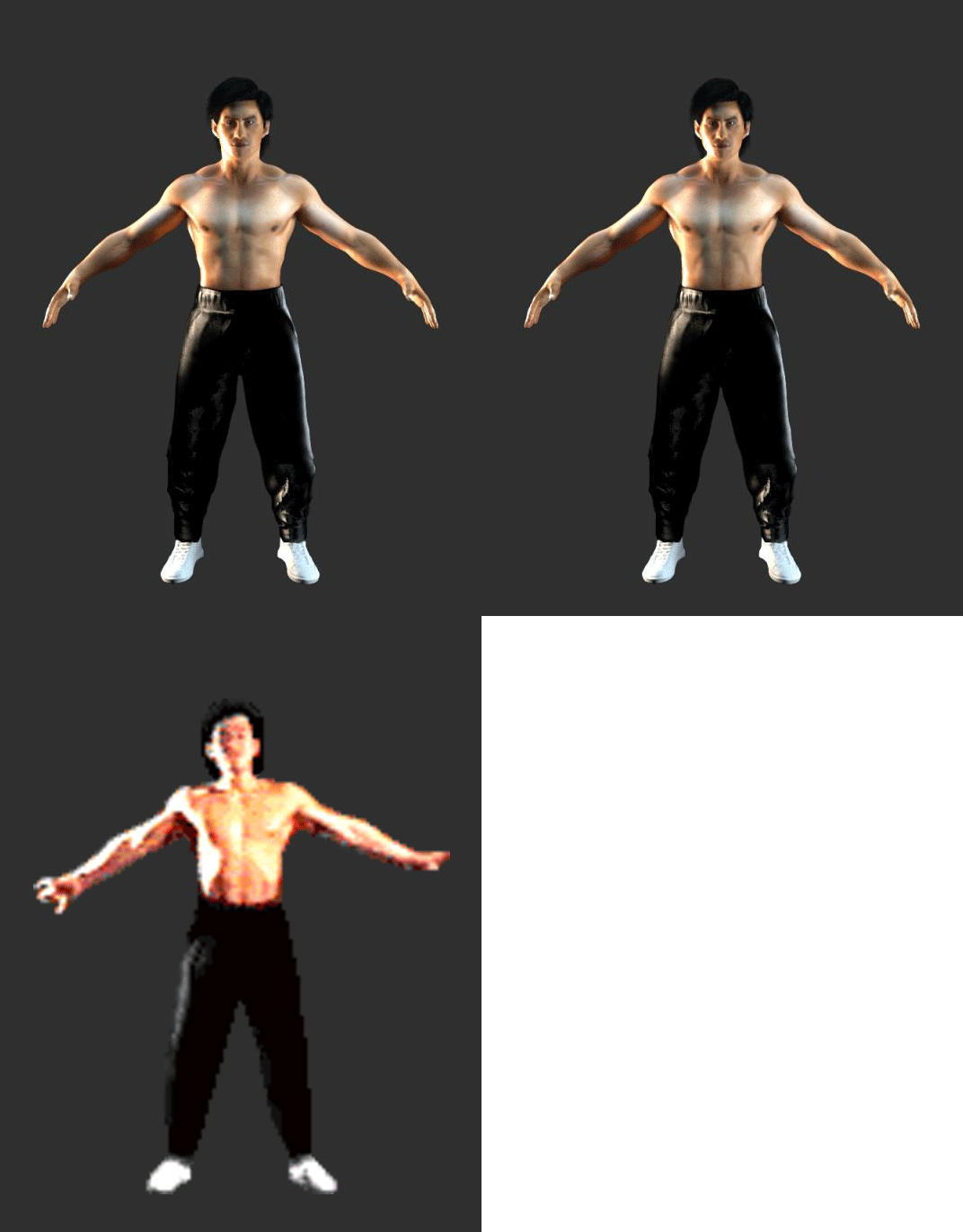
The image quality is better, but I don't know... somehow I think the previous renders looked better.
I think the camera a bit more fuzzy, the lighting is too harsh and his pants now look like plastic.

Also, his face looks dirty like he has dark spots all over, the most noticeable one being in his temple, and the pale band in his chest is too evident now.
Did you increase the contrast in his skin's color or something?

Don't really know what you did differently this time around, but I'm not sure it's good.

That said, the model is looking great, and what I assume is his dynamic hair, is looking pretty good too.

I see you also whitened his shoes again, but now they are too 255-255-255 white.
Tone it down a bit, but just enough to lose that perfection without getting them to look grey.
Maybe just toning down the blue a bit will do the trick. Like a 255-255-245 perhaps.
 
Last edited:
Well, rim lighting is not the problem.
The problem is the lighting making the pants look plastic and the whole scene to look fuzzy.
But let's wait for arq to do his thing.
 
Last edited:
arq, I took a while to try and make a comparison between your latest render and the frame from the victory pose that calactyte posted before, and here's a couple small changes that I came up with.
I tried to make my adjustments account for the slightly different pose.

new1_zpsae57a178.gif~original


- Let the torso go a bit further straight up from the waist without the lats popping out. The lats should pop out at about the height of the diaphragm. This will remove even more upper body mass.
- Make the abdominal muscles narrower, and the ribs with them.
- Make the head a bit narrower, and the neck thinner. Note that the head should only be narrower, not smaller vertically or front-to-back.
- Make the pants' crotch a tad lower. I know you lowered it not long ago, but it still needs to go a bit more.

Other than that, it's really satisfying to see how well it's matching up.
 
Last edited:
just for fun :)

[video]http://host11.aparat.com//public/user_data/flv_video_new/120/49ec48a49d3b377db67d449cf79d125f357267.mp4[/video]


:wiggle::wiggle::wiggle:


last uker's comments on this new model, trying to get right the skin and a more dramatic lighting.... still working to get it better
 
LOL
That's really well done.

EDIT: This comment was about the video. I just saw arq's latest pics. Will comment in a while.

Sent from my Nexus 4 using Tapatalk 4
 
Last edited:
arq, while I do notice that you narrowed the abs, the back is still getting too wide too low.
It also seems like you made the torso get narrower from the waist up, which I'm not sure should happen.
Again, the torso should be mostly straight from the waist up until the height of the diaphragm, where the lats should come out.
Also, probably because of the reshaping, the abs are looking a bit too bulgy.

BTW, the black background makes it really hard to actually tell what's going on with the pants and hair.
 
Last edited:
Body wise, this is the best picture from the game:

obue.png


edit:
His pants, judging from the ending pic and some sprites should look something like this:

ym8y.png


4c6b.jpg


maybe with less visiable folds (that's probably because they're not on a person - not stretched)


I think your previous mistake with his pants was you made them too baggy but from the wrong side. They should be really baggy but when you look at them from the side, not from the front.

His walking animation displays this perfectly:

jfzh.gif
xt7w.png


They're huge from the side, but not so much from the front (like in a winning pose) I think this will be hard to pull off in 3D, because they constatntly change shape due to the angle and movement of the actor.

ajd8.png


^Here for example, in a single animation his left leg (one on the floor) looks really baggy in the first frame and tight on the leg on the last frame.


Also, arq can you pose him similar to these two, angle wise:

k0yi.png


I still somehow get the wibe from your renders that he looks like a child, or a midget with an oversized head. Maybe it's the problem that you're trying to match your stuff and original material but with different angles so you get this result. Pose his feet like he's standing on the floor, then look for his feet in the original pic, how they look in relation to the imaginary floor to try and determin the angle from there.

This is all in scale so you can work with these. Except Test Your Might one, it looks too wide (I see uKER corrected this) but that's how it is in the game.

Just my 2 cents, sorry if this is too much for you.
 
Last edited:
I fix what you said and added red background... remember this is just WIP
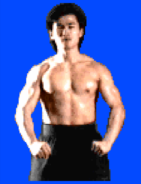
The abs still look a little bulgy, but, man, I'm liking that A LOT!
Incredible work.

Maybe you can model the abs after the pic la_luna just posted.
Here it is with a bit of aspect ratio correction.

obue_zps99bfcb7d.png~original


Something I'm noticing is that his neck is getting thicker towards the top.
Notice how in the original the jaw line breaks the neck's line.

Also, getting to extremely picky territory, you could a make the back of the ear a bit rounder. :)

EDIT: la_luna makes a good point about the pants. Don't know if anything can be done about it mainly due to the dynamic cloth thing, but I think the pants aren't too bad the way they curently are. I was worried about body proportions and that has been taken care of already. Any improvements from here on are a plus.
 
Last edited:
Any improvements from here on are a plus.
Yes, I agree with this.

I liked his previous version of Liu too, really thought that's arq's limit but I see now I was wrong. Good work arq, you are determined to make this as good as you possibly can and I commend you for it.
 
This is all in scale so you can work with these. Except Test Your Might one, it looks too wide (I see uKER corrected this) but that's how it is in the game.
This game this weird issue where it has a 4:3 pixel aspect ratio, but was meant to be displayed on 16:10 displays.
So yeah, that's the way raw screenshots come out, but it's not the way it's meant to look.

I still somehow get the wibe from your renders that he looks like a child, or a midget with an oversized head.
That was the vibe I got from arq's first renders.
However, I think that has been taken care of.
If some of the renders look that way, I think the blame is the wide angle camera, like this render, in which the camera is pointed at his chest, and yet we get to see the top of his shoes, instead of seeing them from the front like in the game.

arq, perhaps you should find a camera FOV that gives you good results and stick to it.
The camera distance to the model should probably be at least two times the model's height.
Then adjust the camera FOV to compensate by zooming in.
 
Last edited:
Top