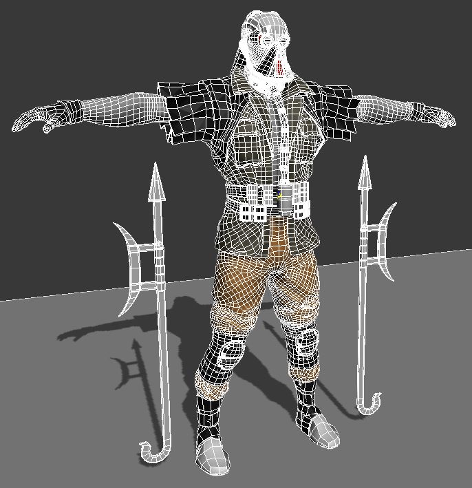
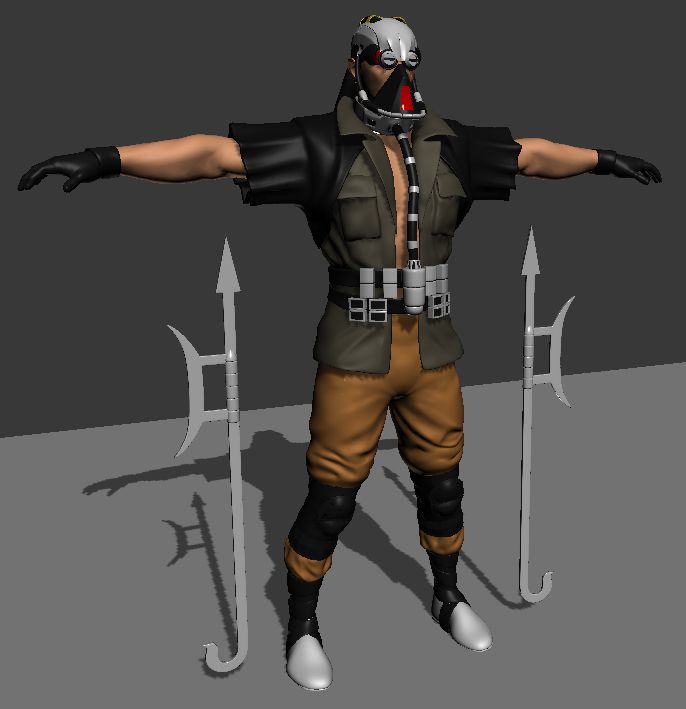
I vastly prefer MrMos3s's versions. Frankly I've had misgivings about pretty much every version of the Cage portrait posted here so far, especially with regards to the mouth and the hair, but I'm satisfied with MrMos3s's last version. It looks close enough to the original portrait; it looks realistic enough; and it looks enough like Pesina/the in-game model. uKER's one may succeed on the first point but I think it fails on the second two.
I think many of the earlier versions posted, and especially the ones by uKER stick to the original picture to a fault. The resolution and quality is simply too low to make a high-resolution version without having to fill in some of the details using your imagination, and I think the issue with uKER's portrait is that every single detail adheres to the upscaled version of the original without enough consideration to what would look "good" or "more realistic". Simple math dictates that if the picture is enlarged by 500% there is several pixels' worth of leeway for what can be considered 'accurate' to the original picture. Let me provide a visual aid to help explain:

This is the GIF uKER posted, scaled down to something close to the original resolution. The shoulders look different from the original, sure, but the face is virtually indistinguishable! So I think it's disingenuous to claim that uKER's version is more accurate - I think it's closer to the truth to say that MrMos3s took more creative liberties when "filling in the blanks" (and my personal opinion is that the final portrait is much better off for it). uKER's version tries to stick as close as possible, but by doing that introduces issues like an exaggerated underbite, an unnaturally straight neck, confusingly asymmetric sunglasses, and a very strange looking giant ear. I agree that uKER's portrait sticks out from the others with its very smooth, airbrushed look, but it's primarily these kinds of things that make me prefer MrMos3s's version hands down.
Please don't take this as a personal attack, or to mean that your work is unwanted or without merit, uKER. My viewpoint is that anyone is welcome to contribute whatever work they want, and I'm sure I speak for most people when I say that any kind of contribution is welcome. I think there's an implicit understanding that not everyone's contributions will be put in the game, but I hope that doesn't deter anyone from contributing, whether it's art, sounds, or simply thoughts or opinions. Even if people prefer MrMos3s's Cage portrait, I think your work is valuable in providing a second opinion or an alternate view on how things can be done. That's absolutely useful IMO, so please don't be afraid to contribute just because you're afraid pictures you create won't end up in the final game.