Mortal Kombat HD Remix with MUGEN

n1frxg.jpg


saw this sketch by tobias, will base him heavily off this

I think this, along with the original clay model and sprites for reference, will give you an excellent result. Good luck with it :)
 
Yeah you can't get much better than the original artists intent when it comes to looks. I'd include those spikes on his head now that there's enough resolution to show them.
 
Nostalgia can also be a trap that prevents one from viewing anything new or improved as better than their rose tinted memories. To be honest with you nothing can compare to the feelings I had playing MK1 at the arcade for the first time. When I first saw it I even doubted it was a real game because of the digitized look I almost confused it with those american laser games like Mad Dog McRee which I didn't consider to be true games. It blew my mind that they could have digitized video of live actors yet have it be a real game. Nothing, I repeat nothing has come close to that for me personally.

I agree it can be a trap, but with good judgement (which is always necessary), the right balance between what is best for the project and what you value about the original can always be found. An example of this is the character anims - the amount of sprites in the original is small, and even though it's how we remember the game, this project requires much more fluid anims. So in this case, we are not sticking to the original game's visuals, but we are sticking to the original intent which was to make it look realistic. As I said, good judgement always has a place.

And I wouldn't be so quick to say you won't be at least almost as excited about this remake when it's complete. Just wait and see :)
 
Yeah, will add the spikes. They're not on the clay model, but I know from Sheeva has them. Anyways, I wanna add them.
goro6.jpg

Woah, nice! He looks like he'll beat the daylights outta anyone thats for sure lol. The whole mouth area looks monstrous, especially without the upper lip prominent like it was before. Cheekbones and chin also improved. Thats exactly what i mean by more monstrous, whereas the previous face looked too human. Expression looks better than before, where he looked like he was sad. nice work! I know you'll get to the higher resolution details later on but one thing that'll add to the effect are the subtle wrinkles around the lip section.
 
haha my first post did have him look kinda bummed out. But cool, cool. Appreciate the comment, so now that I have a fix on the face, will work on his body.
 
And I wouldn't be so quick to say you won't be at least almost as excited about this remake when it's complete. Just wait and see :)

Oh don't get me wrong. I get excited even just seeing incomplete work especially much of the high quality stuff being pumped out like The Pit, The Throne room and Bleed's Ninjas. That's why I've been active in this thread the most out of any threads in this forum.

It's just that no game can ever recapture the feeling I had back then. To be honest everything after MK2 has been a let down compared to my rose tinted glasses memories of the first two games which where complete surprises and to my then early teen eyes looked so realistic as to cause doubts that they where real games. Yes I was disappointed with MK3 because I felt like it was more cartoony and americanized than the first two games. Still played the hell out of it though as it was still MK.

Kind of like a person's first love.. sure you may love others after that but no one will ever be the same as your first. This is not a slight against Bleed or anyone else just that my first impression of the game was so lofty that it's impossible to reach!
 
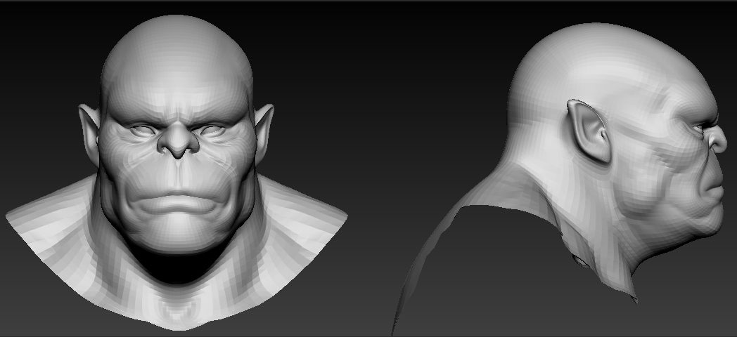
Goro looks great. Basing the artwork on Tobias's concept is definitely the way to go IMO, and I think the latest version of the face shows great improvement. I think his forehead could perhaps be a little more sloped to give him somewhat of a Neanderthal look, and his eyes probably a smidgeon bigger, but you're definitely headed in the right direction.


One thing I was planning to write about last night before I had to leave, was the Palace Gates stage being worked on by calactyte. While I appreciate the work that has gone into it, I do think the stage has some fundamental problems which are both distracting and keeping it from reaching the level of quality it needs. Simply put, the major issue with the stage as it stands, is that it lacks a sense of cohesion and consistency. It feels less like a real place and more like a collage of separate pictures pasted together. This is course how the original levels were created, and it's not necessarily an illegitimate creation method, but as long as it LOOKS that way, it won't look good. I will try to pinpoint and explain what's causing this, and offer my best advice for remedying it.

What immediately jumped out at me when looking at the pictures is the lighting - it's very problematic. For a picture to look believable, it needs consistent lighting. Being an open, sunny area, it should essentially be lit by one light source - the sun - and we can assume that the sunlight is more or less coming from straight above, preferably from slightly behind the camera (so the side of things we're seeing is at least partly lit). This light angle is also helpful because the generic lighting on the characters won't make them look too out of place. However, when looking at the stage, the lighting is truly all over the place. Let me try to illustrate:

templemodded.jpg


Green arrows indicate light coming from the camera, white arrows indicate light coming from straight above, magenta arrows indicate light coming towards the camera from the background, and blue arrows indicate light coming from the left or right, perpendicular to the direction of the camera. Essentially, every item placed on the stage has its own light source, which creates a very schizophrenic look, and nothing really gels with anything else. If we're going for the light coming from straight above (which may be up for debate, but for the sake of argument just roll with it), the only things that look the way they should are the right wall, the lion statues (which however are somewhat problematic since they're mirrored) and maybe the temple and the elements in the far background. Not only that, the shadows coming into the picture from the background heavily suggests light coming from the back, but this isn't actually supported by how anything looks, with the possible exception of the guards. On top of that the trees are somehow casting larger shadows than the Buddha statue, the guards' shadows go in different directions (and overlap - a big no-no) and the wall on the left side is casting a shadow to the left despite its right side being in the shade. Basically, if any shadows are to be cast towards the camera, from the background, everything we're seeing should be in the shade. Aside from silhouettes lit from behind, we shouldn't be seeing any light on any of the objects.

Now, how would I suggest to fix this? Well, I don't expect you to like what I have to say, but in my mind the best thing to do would be giving the entire workflow a complete overhaul. I don't think the current stage is necessarily beyond salvaging, but it would require rethinking certain aspects completely (such as the shadows - they simply don't work at all) and the results would still be nowhere near as good as they could be if the stage was recreated with more of a cohesive vision. As I mentioned, the stages in the original game were indeed created by compositing a number of 2D elements together in an attempt to create a cohesive environment, but that was at least in part because of technical limitations. There were simply limits as to how many and how big elements they could use to piece together the stages, and that meant that, for example, certain parts needed to have generic enough lighting to work in multiple different locations. Since we are not bound by those same limitations, I see nothing wrong with taking a very slight creative liberty and deviating from the original art - in the pursuit of a more accurate and realistic representation of what they were trying to achieve, as opposed to carbon copying the light values of each individual piece that makes up the background.

To make a long story short, I think the background art would benefit hugely from being built as actual locations in 3D. Whether this scene would then be used to render out the 2D elements for use in MUGEN, or simply as a reference for a 2D artist making the final art, or a combination of the two is kind of beside the point. The point is that a complete three dimensional location can be lit in a realistic fashion, which is absolutely key - I honestly think that's the only way to get a truly cohesive and realistic look for any of the stages. Ask anyone working on level design for any game today; creating nice looking art assets for environments is ncie and all, but it's the lighting that creates the mood and sets a memorable location apart from a dull, forgettable one.

This project WILL take a long time to complete. Mostly everyone seems to be on board with that idea, and that's great, but I still feel like some aspects are perhaps a bit rushed - the background art being one of them. It's my understanding that many of the elements used for the backgrounds are being made in 3D already, but I would very much like to see the next step being taken, and make use of 3D for composition and lighting of the stages as well. There's definitely still room for background assets to be made in 2D and composited into the backgrounds - it's a common method even in big budget movies, after all. There's certainly also merit to the idea that certain things are simply quicker and easier to create (with similar or equally good results) in 2D - but this is once again a matter of not limiting ourselves to the technological boundaries of 1992, but instead making the most of the technology we have in 2011.


I hope no-one takes this the wrong way. I don't mean to shit on anyone's work, or come trouncing in with some sort of holier than thou attitude, telling everyone else how they should be doing things - all I want is for this game to look as good as humanly possible. Art assets not being up to snuff in the beginning of a project is not necessarily a problem, they can always be replaced later if need be, and there are certain reasons why having placeholders is a great thing. I just want to keep everyone's mind open to the idea of doing things differently, and what possible benefits there might be. From what I can tell there hasn't been much discussion at all about how things should be done before people have started working on things, and for a project this big I think there kind of needs to be a certain amount of discussion and a consensus being reached on certain issues before people dive headlong into production, or else people will find themselves having to scrap or redo things simply because they didn't live up to standards or specifications not in place until later.

Again, sorry for being incredibly wordy. Would love to hear thoughts and comments from everyone else.
 
gororef2.png


What I love about his classic version, is that he looks like a brute. I don't really like his MK9 counterpart, I understand the direction they chose which was to make him more princely like his title implies, but I feel they lost all that was threatening about him. So it'd be great to see him the way he originally was.
-------------------------------------------------------------------------------------------------------------------------Posted by jarvis653

Dude that picture is realy KINTARO men LULZ not goro but anyways, they are not going to make every detail of goro because he was a doll xD, if somebody have the doll could copie it...but i think mortal gojira's work is better
 
Sorry bringing street fighter to this but i found a moded skin of a character that looks sonya blade :eek: if you want to take a look it the first color
e832py.jpg
Thanks people in trmk
 
People do you remember? In mortal kombat 1? When i was playing in arcade back to the old school days, iv choosen scorpion and when the fight started i noticed that he was red :eek: xD thats awsome! Any Ermac for this game? Like for reptile a hidden character... anyway look this pic
ermacfake3.gif
 
From what I can tell there hasn't been much discussion at all about how things should be done before people have started working on things, and for a project this big I think there kind of needs to be a certain amount of discussion and a consensus being reached on certain issues before people dive headlong into production, or else people will find themselves having to scrap or redo things simply because they didn't live up to standards or specifications not in place until later.

This is one thing that has bothered me too. It can probably be attributed to the fact that people simply don't have much time to work on this, don't have much time to discuss it, or simply don't want to discuss it at length. Maybe brought on by a feeling of urgency around here sometimes, which IMO doesn't belong because we don't have any deadline to meet. Because of it, work has already had to be redone, so in a way more time actually gets spent having to redo things than it would take to discuss them beforehand and make sure their specifications are correct. Since this has never been attempted before, everyone is still finding their feet, and especially in a situation like this, rushing things always causes problems later.

It would be good for you guys to have a set of guidelines and a common workflow, so that everyone is in sync and there are no inconsistencies, thus less chance of problems popping up. Whenever in doubt on a piece of work, seek feedback/advice before putting time into something that could be a product of flawed judgement. In a project like this, good communication is so vital, otherwise you could find that one wrong choice cost you a lot of time. I also don't think people should be opposed to revisiting their work later if need be.

Now onto the rest of your post - from what I understand, the main problem for you is the lighting on Palace Gates. I agree with you that it needs it to be altered, as well as the tone which is quite cold for being out in broad daylight. But I don't see why the stage in its entirety would have to be rebuilt. There are some things about it that could still be improved, but overall the graphics look realistic, high quality and resemble the original for the most part. If I were Calactyte it would certainly frustrate me to have to redo it from the ground up, and I personally don't think that's necessary. I am interested to read what he has to say on the topic.

Another thing I want to bring up is style - the style of the characters and stages in the original MK1 match, neither one looks out of place to the other. Which means if both our characters and stages are made to closely resemble their original counterparts, we will have no problem with the two matching either. There should be a balance really, between staying true to the original stage and making a more realistic stage. The main thing is that it functions as it should, even if it's not the most realistic result.

Dude that picture is realy KINTARO men LULZ not goro but anyways, they are not going to make every detail of goro because he was a doll xD, if somebody have the doll could copie it...but i think mortal gojira's work is better

No, it's Goro. http://www.mksecrets.net/forums/eng/viewtopic.php?f=5&t=5288

And it does seem that MG will be adding as much detail as he can.
 
Last edited:
People do you remember? In mortal kombat 1? When i was playing in arcade back to the old school days, iv choosen scorpion and when the fight started i noticed that he was red :eek: xD thats awsome! Any Ermac for this game? Like for reptile a hidden character... anyway look this pic
ermacfake3.gif

LOL. There was no real Ermac in MK1. You can change the palette of the ninjas in mame with cheats.
 
I agree with Jarvis. We started this project to stay close to the original as possible. I think we should continue down that path. Reptile should stay his cheesy self in this MK, besides we have MK2 next after this anyway.

It's unfinished, new sounds haven't been made for it yet. The composition is perfect as it is though.


My vote is for keeping the gameplay all the same, which means not updating Reptile to his MK2 counterpart. However...I think it would be a really cool surprise to give Reptile his Head Eat fatality. Fatalities have no effect on the gameplay afterall, so I think this could be a great easter egg.
 
There's a image of Goro in the opening of MKII, so if it's going to be of any help, here goes:

2uqy99i.jpg


Hi Jiggeh, the image you posted seem to be 144px × 42px, can you re-upload it in higher resolution?

This light angle is also helpful because the generic lighting on the characters won't make them look too out of place. However, when looking at the stage, the lighting is truly all over the place. Let me try to illustrate:

templemodded.jpg


Green arrows indicate light coming from the camera, white arrows indicate light coming from straight above, magenta arrows indicate light coming towards the camera from the background, and blue arrows indicate light coming from the left or right, perpendicular to the direction of the camera.
 
Top