Mortal Kombat HD Remix with MUGEN

Ok sounds good. I guess my personal preference would be to just keep original music and sounds, but I admire that ambition to redo them especially if they sound spot on.

we can try it anyway, why not? if someone is able to do it, upload a single file and if it's good, then make the others.
we will not use it if does not fit, just if it's fine.
 
Once we go down the path of redoing the voices, then we need to redo all sound FX and probably the music or it won't be right.
 
Hi guys, had to register when I saw all this wonderful work you're all doing.

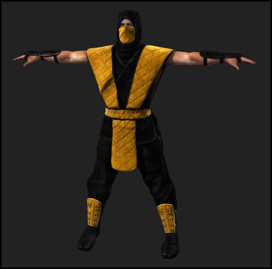
Bleed great work on ninja model, I took a liberty of replacing color on your Scorpion
just to see how Sub-Zero and Reptile would feel like, hope you don't mind.

ScorpMK1_wip20.jpg

24w4rie.jpg

25z47kz.jpg
 
Love it! Would you be willing to colorize 180 frames per character? LOL. Seriously though it looks great.

Hi guys, had to register when I saw all this wonderful work you're all doing.

Bleed great work on ninja model, I took a liberty of replacing color on your Scorpion
just to see how Sub-Zero and Reptile would feel like, hope you don't mind.

ScorpMK1_wip20.jpg

24w4rie.jpg

25z47kz.jpg
 
"BTW, I went to college for design." This is unnecessary. It sound defensive. No one is saying you are wrong, much of art is subjective. I'm an Advertising Associate Creative Director (when I'm not laid-off from work). It doesn't make my opinion more important than yours or anyone else on here.

"Also I doubt he's going to take my suggestions anyway."

LOL, if you mean mindlessly accept all your critics as fact. You sir, are correct. I will not do that. But as I've stated before I care deeply about your opinion and I think it is valuable even if we won't always agree.

Yeah, perhaps it was unnecessary.. it just seems like whenever I make any kind of constructive criticism someone always comes out of the woodwork to say it looks just fine. Everything looks just fine and we should simply go with the first thing that is shown.

Anyway, as demonstrated this isn't about fact anyway more of opinion and taste when you come down to it. A lot of time on the internet it seems like one has to defend what they say. I'm not suggesting you be mindless but perhaps more mindful and less prideful (not that I think you are egotistical or anything).

But since you asked I circled the area that really bugs me... (I'm guessing you have your heart set on the huge crack on the stage so I didn't circle it) http://dl.dropbox.com/u/28944/MK/the_pit_HD_screen_crumble.jpg

Have you given thought to how the blood in the pit looks? Since bodies have been falling down there for a while it wouldn't all be fresh and much of it would be dried up and not be all shiny red.

BTW, the blue color on Sub-zero above looks a little off but other than that those look like pretty good palette swaps.
 
Last edited:
I can change the colors easily, the eyes I don't know. I would need to render sub zero or Reptile as the base with normal colored eyes and change it with the palette.


BTW I can not figure out how to get the transmission effect with mental Ray on the cloth. I can't find anything online to guide me. All I found was an SSS shader that has a Transmission slot, but I get a bunch of errors when rendering and it comes out solid black.

I'm about to give up on it.

I'm going to start on the bones tonight instead, leave it as is until I figure it out.


I agree with your critique smoke.tetsu, I was thinking about the same but I'm not going to worry about it being too perfect. It's lucky we have these people working for free in the first place. I would make the entire bridge and not tile it, and the cracks I'd go 50/50. I like how they look but it's too much compared to the original.
 
Last edited:
Love it! Would you be willing to colorize 180 frames per character? LOL. Seriously though it looks great.
Haha, I did this with Polygonal lasso tool it would take forever and a day. I'm sure there is a faster and equally precise tool to do this (maybe in a program that characters been made in) And let's not forget you need 2 colors for every character so you could tell the difference in Mirror matches.

smoke.tetsu, you're right. After looking at it again, Sub-Zero is a bit too dark I think.
 
BTW, Bleed thinking about scorpion... would it be possible to do it like street fighter does it with the shotokan characters (like Ryu\Ken)? What they do there or at least used to do there is a head swap.

Also if light transmission is too much of a hassle you don't have to do it. It'll probably look fine even without it even if it's not perfect.

BTW, I think in the original game the characters where palette swapped by the engine. I mean sometimes in one game or another especially MK2 a bug can happen and you can catch a ninja using the wrong fighting stance.
 
You can do a head swap in 3D or even mugen. I would make the change in 3D and render out the new sprites.


That reminds me, how are we going to work with palettes in these sprites? We have to render a new batch for every color don't we? You can't use the palettes like in the old mugen for HD sprites.
 
One thing I'd like to know... MK1 has a really strong lighting on the back of every character;
sqkuhg.jpg


you can see the completely blown-out highlights on the back, much more than MKII for example;

11r5hs4.jpg


Bleed do you plan on recreating strong light on characters, and how does that even look on 3d models?
 
I tried, I have a light blasting the costume right now, but it won't go white. I have to set the light strength to something way stronger than normal to blow the colors out like that.

I'll mess with the settings though.
 
Hi Smoke,

Thanks for circling the spot. That was what I thought you were referencing but I wasn't sure.

Your assessment of me as "prideful" is a bit unfair, but I can live with it I guess. If I lost sleep over my internet reputation being sullied every time I spoke on forums, I'd probably be in an insane asylum somewhere. So lets start fresh, I respect your opinion and those of everyone on this forum. I won't always agree; if that makes me prideful, then so be it. I've been called worse. :) Anyway I'll make the changes as soon as I can. As for the blood I did think that it might look dried in some places and maybe not as dry in other places. It's probably going to take a few round of critic to get it.


Yeah, perhaps it was unnecessary.. it just seems like whenever I make any kind of constructive criticism someone always comes out of the woodwork to say it looks just fine. Everything looks just fine and we should simply go with the first thing that is shown.

Anyway, as demonstrated this isn't about fact anyway more of opinion and taste when you come down to it. A lot of time on the internet it seems like one has to defend what they say. I'm not suggesting you be mindless but perhaps more mindful and less prideful (not that I think you are egotistical or anything).

But since you asked I circled the area that really bugs me... (I'm guessing you have your heart set on the huge crack on the stage so I didn't circle it) http://dl.dropbox.com/u/28944/MK/the_pit_HD_screen_crumble.jpg

Have you given thought to how the blood in the pit looks? Since bodies have been falling down there for a while it wouldn't all be fresh and much of it would be dried up and not be all shiny red.

BTW, the blue color on Sub-zero above looks a little off but other than that those look like pretty good palette swaps.
 
Hi Bleed,

Don't worry about it too much then. Have you tried an opacity map? You can use that to make parts of the texture semi-see through and it should work with any material. Again, it's no big deal, we'll figure it out eventually.
 
Hi Smoke,

Thanks for circling the spot. That was what I thought you were referencing but I wasn't sure.

Your assessment of me as "prideful" is a bit unfair, but I can live with it I guess. If I lost sleep over my internet reputation being sullied every time I spoke on forums, I'd probably be in an insane asylum somewhere. So lets start fresh, I respect your opinion and those of everyone on this forum. I won't always agree; if that makes me prideful, then so be it. I've been called worse. :) Anyway I'll make the changes as soon as I can. As for the blood I did think that it might look dried in some places and maybe not as dry in other places. It's probably going to take a few round of critic to get it.

Yeah I attempted to be careful and say "not that I am saying you are egotistical or anything". I apologize if I seemed to be unfair but it almost seems after talking for quite some time that you have been well... drifting towards not being very objective. Especially when it came to the masked guard.

Well, at least something productive is coming from all this anyway even if you don't agree fully when I analyze something and opine on it.

You are probably right about the blood by the way.. some parts would be more dried than other parts.... some of the bodies would also probably be more fresh than other bodies. Like for example the body that kind of looks like Scorpion doesn't look like it's very fresh or the body in the middle wearing black facing the screen that in a way resembles Ed Boon to me.. the heads at the bottom look more fresh though (each of them resembling a different MK dev team member).
 
Last edited:
I tried, I have a light blasting the costume right now, but it won't go white. I have to set the light strength to something way stronger than normal to blow the colors out like that.

I'll mess with the settings though.

Wouldn't that blow out the color on the entire character though?

In the original game they had poor AV equipment which washed out the colors quite a bit and then they went in by hand with a graphics program and colorized the sprites (pretty much the version of photoshop they had at the time). So much of the highlighting wasn't there originally but hand painted in. In MK2 they didn't have as bad cameras and as a result didn't do it as much.... but they kept the same basic technique of colorizing frames of video and touching them up by hand whenever they (midway) digitized sprites for any of their games in the 1990's.

If you just increased the intensity of the lighting in 3D wouldn't it just blow out pretty much all the color including the ones you don't want to be blown out? Personally I wouldn't mind if the highlighting didn't exactly match the original when the game is presented in HD... just like I don't mind that the HD remake isn't fuzzy like the original.

I mean considering our "cameras" now are better than even the ones used in MK3 things now would look better than ever. It's part of the territory with HD.. I mean look at old video taped programs compared to HD programs today. Sometimes video artifacts from taping caused strong highlights to appear or other oddities.
 
Last edited:
That's exactly the problem, I haven't been able to localize the white to the highlights. To get the highlights white I end up blowing out the entire image.

I think I can fake it with a procedural shader though. If I make an almost white texture map and have a falloff mask on it, set to show only the lit areas. Maybe I can get a closer look that way, not sure I have to try.


I can make the fabric a little transparent, I just don't get it lighting from behind which is the main effect I'm looking for.
 
Last edited:
Yeah, there is nothing gained if everyone just agrees with everything all the time. That's why I'm excited about what we're doing here.
 
Top