You are using an out of date browser. It may not display this or other websites correctly.
You should upgrade or use an alternative browser.
You should upgrade or use an alternative browser.
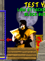
Mortal Kombat HD Remix with MUGEN
- Thread starter Spawn16
- Start date
K1LLKANO
New member
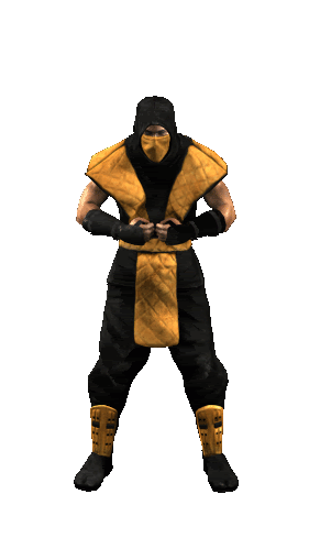
I like the overall animation. The weight of the fabric really shows.
It may not be true to form, but I'd like to see him punching an open hand and grasping his fist. It seems more natural to me that way if you're psyching yourself up compared to bashing your knuckles together.
/wave I still lurk here ;-)
It may not be true to form, but I'd like to see him punching an open hand and grasping his fist. It seems more natural to me that way if you're psyching yourself up compared to bashing your knuckles together.
/wave I still lurk here ;-)
Mortal Gojira
New member
Yeah, I think he puts his hands in a praying manor
TheLevelBest
New member
I made the movement more exaggerated but the whole torso has to move, not just the arms.
What do you guys think, ok or tone it down? The torso bend back and forward.
lol, looks like he's taking a dump in his pants.
Awesome project, I plan on following it's progress allow to the end. Please keep up the good work Bleed and don't leave us hangin like many MUGEN creators. Looking forward to seeing more soon!
la_luna
Member
It's really hard to tell if it's closed fists or in a praying manor, even if you look at it closely:Yeah, I think he puts his hands in a praying manor

@calactyte
EDIT:
All Warrior Shrine statues, .rar file, 820KB:
http://www.adrive.com/public/FG3gR4.html
Last edited:
Mortal Gojira
New member
Kang update

Now that I'm looking at it I think he is in a pray manner also. Thanks for these statues LaLuna
It's really hard to tell if it's closed fists or in a praying manor, even if you look at it closely:
@calactyte
EDIT:
All Warrior Shrine statues, .rar file, 820KB:
http://www.adrive.com/public/FG3gR4.html
He's looking good in general, but I think the likeness isn't there yet.
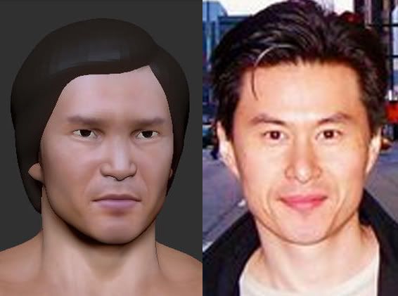
The eyes look too wide, and too far apart. Look at the line from the outside of the eye brows to the outer corner of his eyes.
The nose is thinner from between the eyes to the tip, and hangs down more.
The V in the top lip could be sharper, but maybe that's because of the smile.
Looks like the chin is more rounded
Less cheek fat and they should be nudged down a bit along with the bottom of the eye sockets.
The overall form of the head looks like a V.
The eye brow ridge should be less wide, and show a bit more from his forehead.
The top of his head could be a little bigger.
That's all I see for now.
Last edited:
Mortal Gojira
New member
Thanks for that. How about now?

I feel the likeness still needs some work, but the anatomy looks great.
You're all making me feel pretty terrible about making zero progress on Kano...
edit: oh wow, there were like 12 new replies while I wrote this post, haha. Kang looks better, but still not quite there yet. The main issue I think is that he looks too old, partly because of things like the texture, and the somewhat baggy eyes, but also something about the overall shape of his face that made him lose some of his boyish looks. He looks like a rugged dude with a very strong jawline, I think he should have thinner cheeks and more pronounced chin and cheekbones.
It may be the hair throwing me off, but I actually prefer the previous version. The latest one seems to look a bit more generic. Still, great work, you're making a lot of progress pretty damn fast.
Last edited:
Tiago Bacanhim
New member
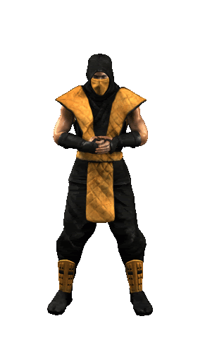
Hahahahah, Bleed, this one looks expectacular, now its like the original, the fingers may not be, but this one is cooler, his like, IM GONNA BREAK SOME BONES !!
laluna you've absolutely mastered getting the team reference materials. Thanks for your help.
Kang is coming along nice. I think you could touch his eyes a bit.
Asians have a distinct upper eyelid

I think his nose is longer too.. maybe shape the eyebrows better.