You are using an out of date browser. It may not display this or other websites correctly.
You should upgrade or use an alternative browser.
You should upgrade or use an alternative browser.
Mortal Kombat HD Remix with MUGEN
- Thread starter Spawn16
- Start date
la_luna
Member
Yeah, I see you made some changes in the background too. Small pillars closer to the flags?Check out the updated foreground pedestals.
I like it.
Do you think you can squeeze a red railing somewhere in the back (even tho it's visible when
only one fighter is in TYM arena) Maybe move small pillars even closer to the flags, and big ones
closer to the edge of the screen and put railings in between, like this:

Love the anvil, looks fantastic, but I think it could be bigger/wider.
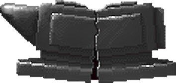
It was one huge-ass anvil in the original game:

Great work man, as usual.
DFGHTENNIS
Member
Updated, anvil version:

yeah,anvil looks great,well done.
the stone tables looking better now,there's just two problems
dragon symbols & the color of stone
i think they should be like this
here's the tables in the original game
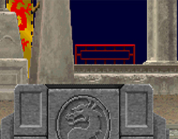
Ok I'll change the color of the foreground stone pedestals. I'm not going to change the dragon's since it looked kind of dumb in the original with big puppy dog eyes and nostrils. Nice work on the comp though. The color is an important thing to match since it creates contrast and will show the items better. Good catch on that.
yeah,anvil looks great,well done.
the stone tables looking better now,there's just two problems
dragon symbols & the color of stone
i think they should be like this
here's the tables in the original game
DjangoJustin
New member
Hey Cal, I think your TYM stage looks great. I hope you stick with the dragon logos you are using. I thought the same things about the original logo. Just doesn't look sinister enough, especially in HD.
EDIT:
I'll try to whip up a version of the Test Your Might Theme soon.")
EDIT:
I'll try to whip up a version of the Test Your Might Theme soon.
Last edited:
Thanks Justin!
Can't wait to hear the new track.
Can't wait to hear the new track.
Hey Cal, I think your TYM stage looks great. I hope you stick with the dragon logos you are using. I thought the same things about the original logo. Just doesn't look sinister enough, especially in HD.
EDIT:
I'll try to whip up a version of the Test Your Might Theme soon.


DjangoJustin
New member
Looks good Cal. The only thing I'd point out is that the wood and stone don't really seem effected by the stage's lighting. I don't know if this is something you're really worried about, but it just seems like the strongest light here would be the moon, leaving the sides of the wood, stone, dragon pedestals, etc that are facing us a bit darker.
The TYM graphics look good overall, but I think some of the "blocks" look better than others. The diamond and ruby are my favourites, but I'm a little unsure about the colours. The ruby may have looked strange in the original game but I don't think it would be particularly heinous to make it look more like actual ruby. The diamond looks even more odd to me, with the very vibrant blue colour. I realise it's very difficult to simulate the refraction of a clear gemstone like that, and I guess just desaturating it wouldn't work particularly well either, but I'd be interested in seeing if you could come up with some way to make it look more like diamond and less like sapphire.
The anvil looks great, but would it really shatter like that? It seems to me like it would make more sense if there was a clearer crack doing down the centre from the point where you hit it - right now it kind of looks more like someone has chopped it up with an axe than it being split by a single strike.
The wood looks pretty weird, IMO. It hardly reads as wood, and the repeating patterns in the texture are very distracting.
On a final note it bothers me a bit how the perspective of the blocks do not match the perspective of the thing they're standing on. That in combination with the 2-dimensional drop shadow really keeps them from looking like they're really there. If that can be worked out I think the final result will look fantastic.
jarvis653
New member
Calactyte, excellent work (as always) on TYM! I would however prefer the original dragon for consistency. Afterall, it is how the dragon appeared throughout the game, and how it is presented in my UI. If you would reconsider, I can integrate it in the tables exactly as I have it elsewhere, if you could send me blank versions of them. Personally I'm not opposed to the look of it, it's not refined like the standard dragon but it does represent MK1. Let me know what you think.
Interloko, if you're ready to start coding again, I'll send you all my files so we can have that portion of the game completed. I've got all in-game functionality like text, counters etc. prepared for you as well.
This game is making great progress
Interloko, if you're ready to start coding again, I'll send you all my files so we can have that portion of the game completed. I've got all in-game functionality like text, counters etc. prepared for you as well.
This game is making great progress
Hi Jiggeh,
Ok couple of notes in response to what you said:
-I'll take a second pass at the wood texture, I agree it isn't correct yet.
-I've been going back and forth about the coloring of the gems and I'm thinking as others have noted that the Ruby should probably be Red and the Diamond should be an almost white blue, like a real diamond. I'm going to make a call here and say they just couldn't make it look like how they wanted in the original, I can only hope that MK purists agree.
-I can probably make a more realistic drop shadow.
-The perspective is never going to be correct since it is the same object rendered on the right and left side. I've tried to render the items in perspective but aside from having a right hand side version of the items and a left hand side version of the items there isn't much I can do about that. I know from a coding perspective Interloko would prefer to receive these items once. So sure the perspective isn't right but neither is the lighting on many of the stages. I'm not too worried about the perspective looking wrong.
-As for how Anvil cracks, I'm not worried about it at all, I think it looks fine.
The TYM graphics look good overall, but I think some of the "blocks" look better than others. The diamond and ruby are my favourites, but I'm a little unsure about the colours. The ruby may have looked strange in the original game but I don't think it would be particularly heinous to make it look more like actual ruby. The diamond looks even more odd to me, with the very vibrant blue colour. I realise it's very difficult to simulate the refraction of a clear gemstone like that, and I guess just desaturating it wouldn't work particularly well either, but I'd be interested in seeing if you could come up with some way to make it look more like diamond and less like sapphire.
The anvil looks great, but would it really shatter like that? It seems to me like it would make more sense if there was a clearer crack doing down the centre from the point where you hit it - right now it kind of looks more like someone has chopped it up with an axe than it being split by a single strike.
The wood looks pretty weird, IMO. It hardly reads as wood, and the repeating patterns in the texture are very distracting.
On a final note it bothers me a bit how the perspective of the blocks do not match the perspective of the thing they're standing on. That in combination with the 2-dimensional drop shadow really keeps them from looking like they're really there. If that can be worked out I think the final result will look fantastic.
Hi Jarvis,
-First I want to ask, have you finished the last 2 UI screens yet? I'd love to see them.
-Have finished retouching the Palace Gates stage?
-Have you found new background mountains in high resolution?
As for the Dragon, if you look at the updated TEST YOUR MIGHT from the cancelled MK HD, you'll note that it is a different dragon symbol. If enough people don't like these Dragon's I'll change them. I personally thought the old ones looked goofy.
Calactyte, excellent work (as always) on TYM! I would however prefer the original dragon for consistency. Afterall, it is how the dragon appeared throughout the game, and how it is presented in my UI. If you would reconsider, I can integrate it in the tables exactly as I have it elsewhere, if you could send me blank versions of them. Personally I'm not opposed to the look of it, it's not refined like the standard dragon but it does represent MK1. Let me know what you think.
Interloko, if you're ready to start coding again, I'll send you all my files so we can have that portion of the game completed. I've got all in-game functionality like text, counters etc. prepared for you as well.
This game is making great progress
DFGHTENNIS
Member
i agree with Jiggeh about the anvil cracks,look at the original
jarvis653
New member
Hi Jarvis,
-First I want to ask, have you finished the last 2 UI screens yet? I'd love to see them.
-Have finished retouching the Palace Gates stage?
-Have you found new background mountains in high resolution?
As for the Dragon, if you look at the updated TEST YOUR MIGHT from the cancelled MK HD, you'll note that it is a different dragon symbol. If enough people don't like these Dragon's I'll change them. I personally thought the old ones looked goofy.
Sure, I'll post all the finalized screens for you guys (though you might be the only one interested at this stage). Honestly I haven't touched on Palace Gates and Mountains yet, but I've got more time on my hands again to take care of it (and other areas of the project).
Regarding MKAKHD, I did notice the original dragon was replaced with the standard one, but I think it was replaced entirely since it doesn't appear in Raiden's ending screen either. So that design choice is still consistent, although incorrect. If you keep the standard dragon on the tables, it'll be the only place it appears instead of the original one, which is odd IMO.