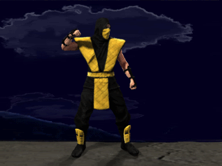
Scorpion look dead on to me. Great job Bleed!!!! I honestly wouldn't change a thing about the animation. It feels right to me. Once the loin cloth is animated as secondary motion it'll be perfect.
The color of the sky was sampled directly from the arcade background though I'm using a gradient instead of a flat color blue. I don't think realism is the goal here. The original game had realistic looking characters in quite unrealistic (and flat) looking backgrounds. It is an artistic preference. I'm willing to give the clouds another go, but I wouldn't be shooting for realism since the original game had very unrealistic looking clouds back there. In fact I might just remake the original clouds as they were to stay closer to the original game. I'm not willing to change the lighting at this point. It looks moon lit and that was my goal. Could it be improved? Absolutely, but it's a huge amount of time and effort to split hairs(my opinion).
I've heard a few people tell me that the mountains aren't realistic enough, but I'm still waiting for someone to send me some new mountains to fix that. It won't look more realistic if I create them in 3D. Again, look at the original arcade. Does the moonlight mountains look real to you? I would be interested in revisiting the clouds and possibly the mountain range, but not anything else. Also we are delving into the realm of artistic opinion vs. fact so it gets sort of murkey. Smoke.Tetsu has heard me say this several times already, but I want to reinforce it here again. I value your opinion and suggestions even if I won't always agree with them. So by all means please continue to point out the things you don't like. I'll selectively go through and 'fix' what I agree with.
Perhaps I could've explained it a little better. Basically, in the original game the devs could get away with unrealistic/flat looking backgrounds, because of the lower resolution and considering their tech and budget, I'm sure it was really the best they could do. I don't believe though that all aspects of their design can hold up in HD, and extra details are needed to reinforce the original idea; you've already included some yourself, such as cracks in the bridge, less uniform texture etc. and I think this stuff is necessary (or a necessary evil) to bring those backgrounds to life. The most important of those extra details is lighting IMO.
But realism isn't actually the point. The point is consistency. However unrealistic the original backgrounds are, they work with the digitized actors. For the most part at least, they were limited by the tech after all. In a HD setting, if Bleed is making his models as realistic as he can, the appropriate thing to do is to make your backgrounds as realistic as his models. Otherwise, they could look disjointed and not function as they should. That's why I believe artistic opinion on this topic is irrelevant, because the goal should simply be to match your work to his work; in this case, match the level of realism. If he was making more illustrated characters, it'd be your job to make just as illustrated backgrounds. That's probably the best I can explain it (after so many edits). I think the cancelled MKAKHD took this realistic approach as well, from seeing the type of work that their background designer did (if that has any bearing).
Of course I am talking within reason though, to just do the best you can with the time you have. If making more elaborate lighting for instance is just not practical for you, then that's fine. However considering the amount of time we have to finish this project, which is a lot, I don't think it's a bad idea to leave it as something to revisit later after all the backgrounds are done. Otherwise if someone else of your skill level approaches us about the project, you could pass the responsibility of lighting over to them if you feel it could be improved.
Anyway I am always open to other opinions so again please share your thoughts on this.
PS: I can send you new mountains if you need them
")

