I'll do the posing because I have the software and know what needs do be done if something goes wrong. The shaders, stage and lighting needs to be set up a certain way aside from doing the pose.
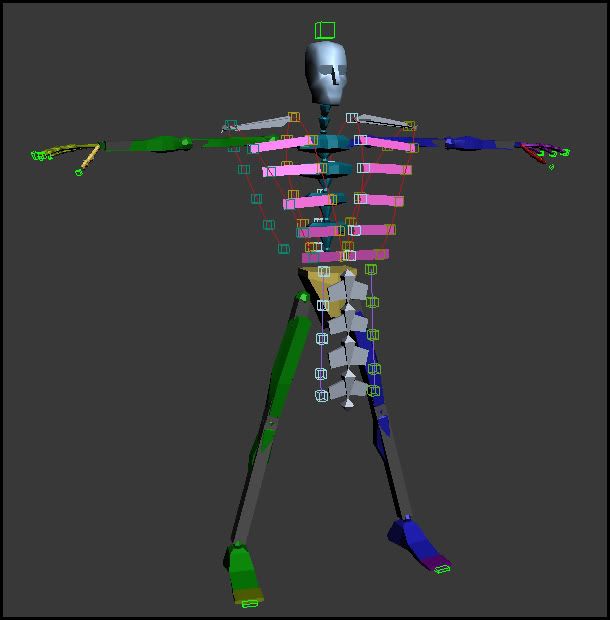
I can render a pose after all that and send the picture for someone else to put it together for the endings.
I can render a pose after all that and send the picture for someone else to put it together for the endings.
Last edited: